Banner ads are tried-and-true forms of advertising that can deliver great results while driving a return on investment. So why are advertisers so hesitant to use them?
Maybe it's because they have been overrun with cheesy, annoying, misleading, and downright dumb content, creating an aversion to this otherwise effective form of advertising.
We've all seen those silly flashing ads across the top of our favorite websites that promise a free iPod when you choose which brand of fast-food French fries you prefer. But who actually clicks on those things anymore? It's a shame that such an important online-advertising avenue has been tainted for so long with such content.
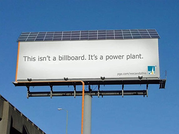
In their design and potential effectiveness, banner ads are very similar to outdoor billboard advertisements. They have to be quick, catchy, and well planned out to be effective.
Here are three rules for outdoor advertising that I learned in my college advertising class that can be easily translated into creating effective online campaigns as well.
Rule 1: Make your point in eight words or less
This is a very strict rule for outdoor ads. Vehicles pass by your advertisement at increasingly high speeds, so you need to get to the point, and fast.
This rule is also true for banner ads, as those navigating around Web pages do so at lightning speed. If you want to have any chance of communicating with viewers, you'll have to make it snappy.
Keep in mind that this is simply a branding opportunity. This is not the time to be spewing out information about your company's philosophy, newest green project, or even a product's features and details. This is exposure. This is an impression. That's it.
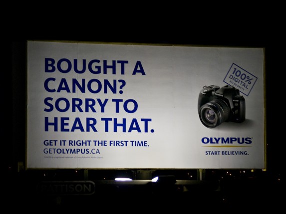
Rule 2: Think exclamation, not explanation
This rule goes hand in hand with the "eight words or less" idea but takes it a step further. These ads are going to deliver results only if there is synergy between the copy and the visual presentation. That combination is what needs to speak to the viewer—not an extensive amount of text, no matter how well it's written!
Rule 3: Use large, bold letters; short phrases; and one dominant visual
Communicate one idea. Yes, you may have the option to use a flash banner with eight different faces that a customer will see, but the average person will give your ad only three seconds of their time, making it impossible to get to the point.
Using large letters, catchy phrases, and one dominant visual will help communicate your message quickly and effectively.
The best ads, whether indoor or outdoor, are the ones that are the most creative while also being the simplest.
If given the makeover just described, those weathered forms of advertising should prove more valid players in the online-marketing arena. With a little thought, you can ensure that these little ads have a big impact.


