Earlier we explored how bad data can ruin a campaign. On the other hand, what good is great data if your creative assets don't catch the attention of your audience?

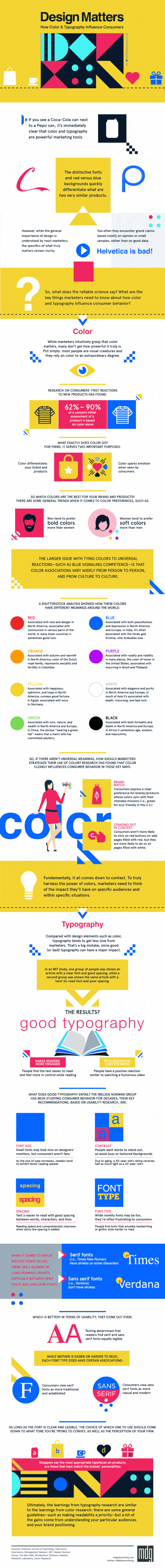
Color and typography are two of the first features people notice in advertising, and those two elements can set the tone for your entire brand.

For example, fonts with serifs give a sense that a brand is established, while sans serif fonts make a brand seem more casual and modern.

That's according to an infographic that explores how consumers view a brand based on its colors and typography—and how marketers can make the best design decisions for their brands.

Check out the full infographic by MDG Advertising:


Enter your email address to continue reading

How Color and Typography Influence Consumers [Animated Infographic]

Don't worry...it's free!

Already a member? Sign in now.

Sign in with your preferred account, below.

Did you like this article?
Know someone who would enjoy it too? Share with your friends, free of charge, no sign up required! Simply share this link, and they will get instant access…
  • Copy Link

  • Email

  • Twitter

  • Facebook

  • Pinterest

  • Linkedin


ABOUT THE AUTHOR

image of Laura Forer

Laura Forer is a freelance writer, email and content strategist, and crossword puzzle enthusiast. She's an assistant editor at MarketingProfs, where she manages infographic submissions, among other things.