Here's an infographic for all the font geeks out there (or should that be "typeface geeks," as we recently learned there's a difference between fonts and typefaces?)
Letters are more than just lines and dots, and this infographic by the team at graphics creation tool Visme explains just how personified letters are—at least in the case of typography terms of art.
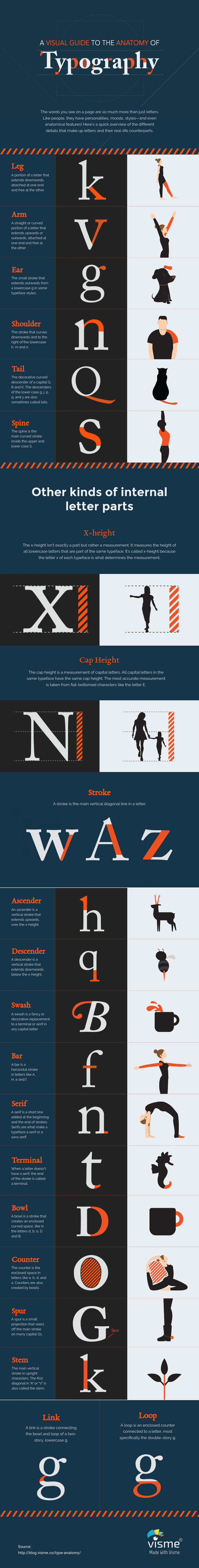
For instance, did you know that some letters, such as uppercased K and R have legs, whereas others, such as lowercased N and M have shoulders? Many typefaces even include ears—that little stroke that extends outward from the top of lowercased G, in some cases—and the S has a spine, the main curved stroke on the inside of the letter.
But not all terms are connected to human anatomy: The "x-height" measures the height of lowercased letters, and the cap height measures the capitals'.
To learn more typographic terminology, check out the infographic. Tap or click to see a larger version.