These days, you've probably received emails from every brand you've ever interacted with over the past 20 years, telling you about what they're doing for their community and customers in these "unprecedented" times of the COVID-19 pandemic.
If they're smart (or just plain wiseacres), your prospects and customers might have already started filtering out emails based on that word.
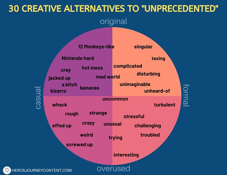
So here are some creative alternatives to "unprecedent" you might consider using, all in one faux scatter chart... ("faux," because it mimics the form of a scatter chart, but it's not based on the plotting of data having to do with distribution or frequency of occurrence or some such).
The graphic was created by content studio Hero's Journey Content. Its author simply used her editorial judgment (and sense of humor) to create the graphic.
In it, you'll find options—from irreverent to buttoned-up—that can fit just about any brand's tone of voice and communication needs. Check it out: