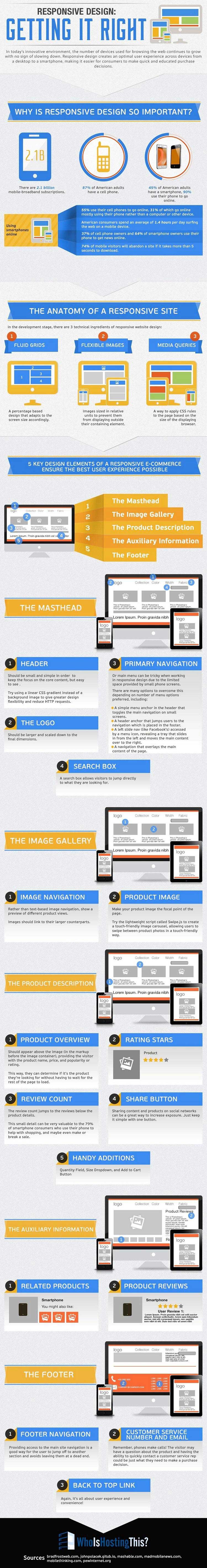
People have little tolerance for Websites that don't accommodate their mobile devices: For example, 74% of mobile visitors will abandon a site if it takes more than five seconds to download, according to the research cited in the following WhoIsHostingThis? infographic.
Responsive Web design is one of the best ways of ensuring that your audience's online experience is equally viable across mobile and desktop environments, particularly if yours is an e-commerce site.
If your company hasn't yet considered using responsive Web design, you might well want to, especially if many of your website visitors are using mobile devices to access your site content. Any many probably are...
So start planning for responsive Web design now.
And when planning, make sure your site has these five critical elements, especially if you're selling products or services online: a masthead, an image gallery, product descriptions, auxiliary information, and a footer.
For more details about those five elements, take a look at the following infographic:


