Looking at the evolution of social media over the last few years, you can plainly see that social media sites are being driven by imagery. Consider Facebook's Timeline (and its acquisition of Instagram) or the breathtaking rise of Pinterest, and you'll see evidence of a visual revolution.
Dozens of resources are available for choosing killer Facebook cover photos or putting together must-follow pinboards. However, we forget that email, too, is a social medium. And now is a great time to evaluate how you use images in your email marketing.
In particular, acquisition email campaigns—those designed to gain new customers by addressing an email ad to a publisher's list—require attention to the images used. Because they are paid media, acquisition email campaigns can be more costly, but they are also a good opportunity to start off a relationship on the right foot with a new customer.
At my company (where we assist advertisers in optimizing offers to get into the inbox and get noticed), we see a huge variety of acquisition email creatives. Below are our Top 3 tips for making your campaigns more visual while maintaining an eye on the overall strategy of your brand. Many of these are equally applicable to acquisition and retention email.
1. Remember that images must make the right first impression
The sheer volume of strange images that appear in the ads on Facebook should give you an indication that, sometimes, weird images drive clicks (even if only among the curious).
In acquisition email, though, the email may be the first time your brand is in front of a potential customer—in an environment that's very personal: their inbox. If you're doing acquisition email the right way, you've even gotten an introduction from a brand that the recipient trusts (to minimize spam reports, acquisition email should include the name of the list that the consumer subscribed to).
Your emails must be clearly branded. Obviously, that means your brand's logo should be visible, but it also means that other images should match the aesthetic of your brand. The goal is not just to drive clicks and conversions but also to introduce a consumer to what your brand stands for. Moreover, your imagery should be designed to draw attention to your call to action.
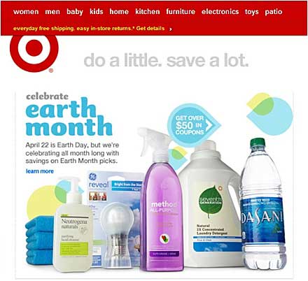
The following Target email is good example. Every image matches the brand's clean and sleek aesthetic, even while driving people to "Get over $50 in coupons."
2. Keep images fresh and new, but maintain consistency in different environments
If you do acquisition email (or any type of email marketing) on a regular basis, you know you need to change out creative frequently, just as you would for advertisements. Still, your brand should shine through in all treatments.
Just as important, your landing page should address the needs of subscribers who clicked through from your email; it should also make sense with other representations of your brand that the recipients might have seen. That means keeping your logo visible, using images that reflect your brand's story, and keeping the content of the landing page relevant to the content of the email.
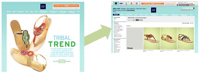
In this regard, GAP does a consistently great job in its emails. An email promoting new sandal styles goes to a landing page showcasing the sandal styles for purchase:
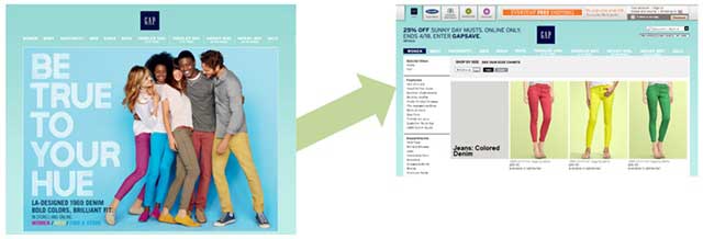
An email that promotes colored denim takes you straight to a landing page featuring colored denim:
The intent isn't just to make it easy for consumers to buy the products they're interested in. It's also to let them become quickly oriented, visually, on a page.
Carrying your branding through in a consistent way enables a customer to quickly confirm that they've gotten where they want to be. Similarly, including your logo and visual elements that evoke your brand in your email lets potential customers get comfortable with your brand before they land on your website.
3. Don't waste great images by getting it wrong on the technical side
You can create beautiful emails, but if they come across the wrong way in the inbox, you've wasted time, effort, and great images.
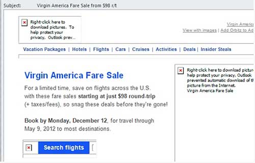
Case in point: What would you do if you opened an email that looked like this? (Censored to protect the guilty.)
![]()
The email looks nice once you enable images, but what you're seeing is everything above the fold in the browser. How many people do you think will actually display the images when there's nothing on the page to pique their interest?
On the technical side, you should follow these few rules to optimize your emails for viewing in the inbox:
- Use alt-text for images. Though having your image display immediately would be better, including an alt-text description that subscribers can read encourages them to manually enable images. The majority of email client software won't automatically display images, so offering a teaser is the next best thing.
Bonus: If the top of your email is an image, alt-text will display as a snippet, so make sure it says something more enticing than "header."
- Mix real text and HTML elements with images (also called background images). There's more than one way to get visual. Mixing elements such as real text and HTML background colors can capture attention with visual elements that will automatically display (and, again, entice customers to enable images to see your full email).
The "button" below is really just a background color with text in a table:
- Include a text-only version. No, it's not sexy. And, no, it's not particularly visual. However, it should take a short time to create through an ESP or acquisition email vendor, and it serves two purposes.
For one, it makes ISPs more comfortable with your email because they can run the text version through their content filters, making it more likely that your email (with its fantastic visuals) will make it to the inbox.
For another, it makes your brand more accessible to the few people who prefer text emails, or those who have just a text reader on their smartphone.
* * *
How about you? What do you find most important in keeping your emails (acquisition or retention) visual and engaging?
(Photo courtesy of Bigstock: Big eye)


