Many B2B homepages are becoming more like Times Square every day. The real estate is dividing into a myriad of different billboards, each touting its own message: "Look at our awards," "See our customers," "Free trial over here."
Many such "billboards" are flashing or scrolling to catch the visitor's eye, often in competition with one another.
The question is, are your visitors like tourists strolling through Times Square on their way to a matinee with little time to spare, or are they a captive audience willing to watch and absorb all you hope to communicate?
Websites increasingly appear to assume the latter, but Web-analytics data prove the former.
Some Web designers can elegantly shoehorn anything into a homepage. They use Flash to pack complex positioning and differentiation messages into a one-minute video or slide presentation. They accommodate offers for a free trial and a demo by shrinking the offer buttons. They squeeze in sections for recent news listings and upcoming events.
But what is being overlooked is that more really is less. B2B website visitors are impatient and have the attention span of fruit flies. The more content you cram in your homepage, the less likely visitors will notice the most important content.
When you avoid choosing which content or messages are most critical, you are choosing for them all to be mostly ignored.
Here are some dos and don'ts for B2B homepages. If you observe these, you should experience longer site visits, lower abandonment rates, and greater lead captures.
Do keep your value proposition prominent
Approximately 10 years ago, graphic designers started making liberal use of the anchor graphic—a large image, typically in the upper-left-hand side, usually showing smiling people.
Marketing and sales executives respond viscerally to Web designs with anchor graphics. We assume our visitors will, too. They might, but they may also pay less attention to our value proposition when they do.
See how your eye is drawn to the faces and away from the text in the following example?

Using a different-color font or better shading won't solve the problem. Your value proposition should be the first thing visitors notice and the one thing you want them to remember about your company. Don't let your designer use any anchor graphic that draws attention from your value proposition.
Don't bury your value proposition in video
Web pages used to be limited to an 8" x 6" block of screen real estate. Video, animation, and slide shows can—in theory—quadruple the real estate exposed to visitors. As a result, those options encourage marketers to be expansive when they should be concise in conveying the company's value proposition and differentiation.
Doesn't motion on the screen catch the eye? Certainly. And then your visitors have 3-5 seconds to figure out if it's something they want to watch.
Your Web visitors won't stick around to watch a 60-second video, animation, or slide show of messages that you want to communicate. If they don't see what they're looking for, they'll quickly move on. Motion might drag their eye back again, but only until they realize that's not what they are looking for.
Whatever you do, don't bury your value proposition and differentiation in a Flash video, animation, or slide show. Give them a prominent, stationary position. And hone them to a concise statement that is easily digested before visitors' eyes start to wander.
Do use video intelligently
Video (e.g., customer testimonials, chalkboard explanations, or demos) has an invaluable role on websites.
But the best way to use video is as YouTube does: to have an image block representing the video with the Start button in the middle and an explanation of what your visitors will get from watching the video.
Your visitors need to be in control—to be able to start and stop the video—and know what they will learn if they take the time to watch it.
Don't use motion just because you can
It's tempting to use scrolling lists for news summaries or customers, or to use flashing messages about upcoming events.
But use motion sparingly on your homepage. You don't want to distract visitors' eyes from key messages and offers.
If you do use motion, consider having it stop after five seconds rather than continue to distract visitors.
Don't over-share—pare, pare, pare
Some well-meaning B2B companies lack the discipline to pare down their messages to what customers care about.
Visitors stop reading sections quickly if they are not finding useful information. In the following example, look at how much extraneous information there is before the vendor talks about what it actually does.
Keep in mind why print advertisements have so much white space and so little text: When you have a few seconds to make an impression, you have to be selective about what you say and concise in how you say it. The same is true of initial impressions on homepages. Do not be scared of white space.
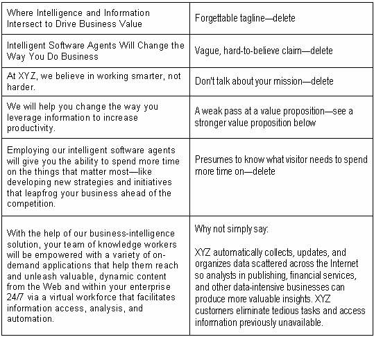
Do refine your value proposition
Many websites don't invest the time and effort to distill their value proposition into clear and concise answers to their visitors' questions ("Do you solve a problem I have in a way that makes sense for me?").
The result is often an excessive amount of text larded with jargon that kills visitor interest.
See "Don't Make These Value Proposition Mistakes" for tips on common mistakes B2B companies make with their value propositions and how to strengthen yours.
Do remember that 10 goals are as bad as none
The most common home-page disasters occur because the vendor couldn't choose among objectives. Here are 13 common home-page goals and objectives:
- Communicate the value proposition
- Convey credibility through...
- Awards
- Analyst reviews
- Customer lists
- Partners
- Customer testimonials
- Imply momentum by sharing news announcements
- Capture leads or educate through...
- Whitepapers
- Case studies
- ROI calculators
- Free trials
- Demos
- Invite visitors to upcoming events
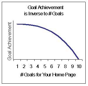
You cannot address most of those goals and objectives at once on your homepage without greatly impeding the attainment of any one goal or objective. You are better off picking three or four (always include communicating your value proposition) and investing your home-page real estate in achieving them.
Remember that you have other pages on your website. If you do a good job grabbing the interest of your target audience, showing them your relevance in solving their problems and giving them a reason to look more carefully at you, they'll visit more of your Web pages.
If you cram in content to tackle each goal, you'll probably fail to capture their interest or help them determine whether you solve their problem. And you'll end up with tiny blocks or buttons for "Demo" or "Free Trial" that are easily overlooked.
Begin fixing your homepage by identifying your top goals. Then use those prioritized goals to streamline what you show visitors. Grab their interest, and they'll spend time on your other pages investigating additional offers and information that can move them along in the sales process.


