In my day job, I live and breathe A/B testing. Pouring through various case studies found on the Web (and some from our own customers), I have found a few patterns on what works. Based on those case studies, I am going to share three tips you can use on your own site to improve you conversion rates.
1. Use SEO Keywords in Headlines
Look for the search keywords that visitors are using to find your site, and create different versions of your headlines using those keywords. Use the Google AdWords Keyword Tool to find related keywords, and use those in the headlines of your page titles and in the body of your text. One effective strategy is to use low-competition keywords to improve search-engine rankings and generate traffic.
Using keywords strategically in headlines will improve your organic search-engine rankings and drive more visitors who are genuinely interested in your site—and, therefore, improve your conversions.
The best headlines combine compelling propositions to increase conversions and SEO keywords to increase search traffic. 37Signals wrote a case study on its experience testing headlines. And Copyblogger has a series of headline-writing articles that are well worth a look.
2. Answer Questions on Landing Pages
Find the top entry pages for your site, such as the homepage or landing pages, and improve their current elements and incorporate new elements. To improve your conversions on those pages, you will need to get creative to engage visitors.
Simplify those pages by removing elements that may cause friction to your visitors. If you have auto-playing videos or pop-ups, think of new ways to present the content they contain. Could a screenshot be more effective and less intrusive than a video?
Pretend that you are a visitor to your website. What question did you have when you visited your landing page? Your landing page should answer that question simply—with clear language and images. When you have a problem in real life, you turn to people who can help you. The same principle applies to landing pages. Prove that you can solve your visitors' problems!
This click-rate test featured a redesigned page that removed a large "Secure" icon from the right sidebar. The revised version was presented randomly alongside the original version of the page in equal distribution, and the redesigned page resulted in four times as many downloads!
But don't remove your "Secure" icons just yet. Why? Because context is vital to your conversion rate. Which explains why in another landing-page test, the lock icon https://www.abtests.com/test/211001/landing-for-hawk-host dramatically improved conversions over the original landing page.
3. Simplify Your Fold
People are tired of looking at similar websites filled with marketing messages. Do you ever tire of Google? Probably not because the site's design is streamlined and visually soothing. Plus, it features new doodles to celebrate special occasions so you never get bored.
You can use the same concept with your website! Though daily deals sites, such as Woot and Groupon, are naturally built for simplicity, you can borrow their techniques to improve your site. Those sites capitalize on the fact that they sell one item per day by featuring it alone in the fold, the area in the upper half of a Web page. They leave white space around the image so visitors can focus on the details of the image.
But daily deals sites aren't the only ones that use this principle; Amazon and the New York Times do, too, featuring large images in the center of the fold on their websites.
Get creative, and unclutter your fold so your visitors can focus on your website. Look at this website, and don't read further until you do. Did that change your perception of scrolling down a page?
Look at the following screenshots from a landing-page case study by Vendio. Which had the higher conversion rate?
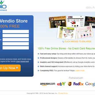
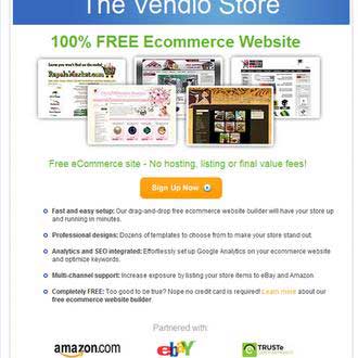
The simpler fold design on the bottom increased the conversion rate by 60%, despite introducing an extra step to the sign-up process. You can read about that in the testing case study.
Conversion Rate = Success
Think of your favorite retail store or service business. You look forward to your visits there because you know you will get great service and a fair deal. That's the experience you want your visitors to have when they browse your site.
Whether you're running a blog, a service business, or an e-commerce website, your conversion rate is how you define success. Since you're already getting traffic to your site, the next step is to improve your success rate.
After all, that's why you created a website—to deliver a superior experience to your visitors and convert visitors into customers!
(Image courtesy of Bigstock, Series With Columns.)


