The idea behind an app is just the beginning of a long, sometimes smooth, often difficult path on an app's journey to success or failure.
Rest assured that quite a few mobile app marketing and development mistakes have been made along the way of any app's journey—from how the app maker designs the mobile user experience (UX) and user interface (UI) to in-app purchases.
How the app makers learn from these mistakes is what empowers them to take the app to the next level. So let's take a look at some common mistakes on the path to creating an app that engages users.
Mistake 1: Incorrectly Onboarding App Users
Every app marketer wants active users. From the moment a user touches your app, you want to be creating a positive experience, which begins by onboarding. Think of onboarding as constructing an entry ramp to a highway. You want users to have a smooth experience when getting onto your app.
Numerous mistakes can be made when onboarding, but I'll go over one mistake that has hampered many an app's growth: forced registration.
What is one of the first things you usually do when launching an app for the first time? Register, right? Think about it: You don't know much about the app aside from recommendations by some people or lots of buzz about it.
Forced registration basically tells you, "Sign up first, and we'll show you what we're all about after." Forced registration is a mistake. Don't let your users become victims of the signup brick wall.

Solution: Allow your users to experience your app first. Give them a tour; show them what your app is about before making them commit. Most of the time, after experiencing what your app has to offer, they will gladly register and you'll be able to retain them as users.
App publishers are now offering first-time users content-driven offers as alternatives to registering, and active user numbers and retention rates are soaring in response.
But let's take a look at the Product Hunt app, which has an even more novel approach. It not only bypasses forcing users to register or sign in but also doesn't walk them through a tutorial. Upon initial launch, it instantly takes the user to a feed of the top products that are trending:
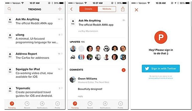
Users get to browse at their leisure until they'd like to make a comment or make a product suggestion. Only at that point does the app require sign-in. It's a good example of an app that doesn't present any barriers to the user, offering them a chance to play first.
Of course, that model won't be applicable to all apps—and only when an app isn't too complicated to navigate without a tutorial. Apps relying on a social network obviously would require a login. (For more strategies and best-practices for onboarding, see "Refining Your Mobile Onboarding Experience Using Visual Analytics.")
Mistake 2: Mobile UX Design and Not Knowing Your Audience
UX designers might think they know who wants to use their app, but do they really know them?
The problem here lies with who exactly is creating the apps and who is using them. The creators of the apps are mostly Generation Xers, age 30-55. The most prominent demographic in the US are the millenials, those below age 30, and Baby Boomers, those over age 55.
So, the developers of apps are creating apps for those in other groups, not their own, and those groups have a different conception about what makes a technology cool and useful.
Solution: App makers need to conduct a lot of research into their target audience to understand preferences, culture, behavior, and so on if they are reach educated decisions on what to incorporate into their app.
For example, Chinese audiences are attracted to the color red, associating it with good taste and the positive. Chinese developers might want to incorporate the color in their app, particularly in calls to action. Color psychology plays a huge part into making an app attractive to a culture, so do your color homework.
In addition, you need to possess in-depth knowledge of the distribution of various mobile devices and operating systems among your target audience.
For example, users on Android and iOS devices use different gestures to take the same action—made all the more tricky by the diversity of numerous Android devices, and relatively few iOS devices. Simply taking an Android app built for a Samsung device and porting it over to an iOS device will almost certainly fail.
Mistake 3: Not Testing Pre-Launch and Not Measuring Post-Launch
Not testing pre-launch—not performing app testing, or not doing it thoroughly—is a huge mistake. Before the launch you need to identify problems such as blank screens in certain sequences, gestures that don't work as they should, app crashes, and on and on.
Solution: You need to develop a comprehensive mobile testing strategy that encompasses all the elements of your app as well as the environments that will be used, including target-device testing, network testing, and all app features to ensure that nothing interferes with the user experience as you planned it. (Read more about various types of app testing, such as functional, performance, and compliance.)
Not measuring post launch is a common mistake of app makers. That is, they don't implement mobile analytics from day one, or if they do have it implemented... much of the time they do not measure the right metrics, or they focus on numbers instead of causes and reasons. App optimization cannot be accomplished effectively without proper monitoring.
Solution: Post-launch, if you want to discover that area of your app that's ripe for optimization, you should be monitoring the key metrics under engagement, such as retention, user flow, and session lengths. Moreover, app makers should distinguish between downloads and active users. By monitoring key metrics, you will be able to see where users are spending the most time, where in the app they are bouncing, and how often they return to use it. (See more about what metrics to measure.)
Going beyond key metrics, app makers need to understand the reasons behind the numbers by deeply diving into the user experience and seeing exactly how users interact with their app. Using visual mobile analytics to analyze the user experience is crucial to app optimization.
Conclusion
In this article, I named three common mistakes made in the course of mobile app marketing and development. I also suggested solutions needed to correct those mistakes.
Identifying where your app delivers and where it does not is half the battle to a winning app; discovering the why and seeing where your app needs work using visual mobile analytics will streamline the path to the ongoing process of app optimization.