With email inboxes more crowded than ever, your message's successful arrival in the recipient's inbox is half the battle. Assuming you routinely have good deliverability, the second half of that battle is standing out from the crowd.
The majority of email users (more than 70% by some estimates) view the lineup of email messages in their inboxes via preview panes, so only a snapshot of each message is visible either on the right side or on the lower half of their screens. Checking email via a mobile device can be even more limiting, eliminating previews altogether.
Like it or not, that is the reality for email marketers today, which is why it's essential that your email messages not only pop and get straight to the point but also make a memorable entrance!
What follows are three tried and true creative tactics that'll always boost your message appeal. Although you may have seen these tactics applied to marketing and advertising in offline channels, they can have a greater impact online than offline—especially because of short attention spans and email's deliverability and rendering issues.
1. Compelling, Colorful Headlines
Compelling and colorful headlines stand out and are easily readable in preview panes. They immediately draw the reader to the main point of your message.
Don't rely solely on a graphic header, such as the one that may be topping your blog or site, to do the job of a headline; they're two different things. Though a graphic banner or "masthead" may be fine for e-newsletters, other marketing messages require more punch and relevancy. Each deserves a unique headline.
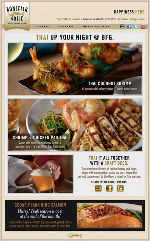
Take a look at the following example from restaurant group Bonefish Grill (which has a history of great email headlines, by the way). Notice the great headline copywriting and how each section of the message has a sub-headline to draw the reader in.
Tip: Headline fonts, sizes, and colors are routinely tested, but you don't need to go to such lengths if you simply follow the graphic standards of your brand and marketing communications. So, don't forget that headline, and try tying it into your message subject line, too.
2. Pictures, Please!
Eye-tracking lab studies measuring how people visually interact with email have proven that messages with images have higher readability than those without.
Although including a picture of a product is an obvious tactic to increase advertising effectiveness, much email marketing is not product or retail oriented; it's service or content oriented. Finding relevant photos and images for those types of messages is just as important as it is for messages sent by clothing and furniture retailers, whose catalog-spread-style emails and sites consist largely of images.
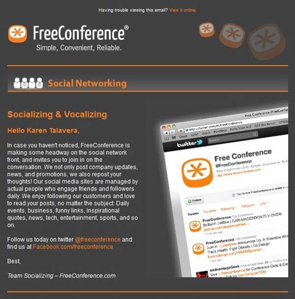
See how much more interesting this B2B email for phone conference services looks with images vs. how it would have looked with text alone:
Tip: Include at least one image in every promotional email. Photos are ideal, but even illustrations, cartoons, caricatures, logos, and icons are effective. Experiment with different percentages of copy vs. graphic. Editorial-style emails are usually heavier on copy than graphics, but you might find that a highly compelling photo with a strong headline and short intro paragraph works as well as (or better) than your meatier messages.
3. Less Is So Much More
For effective email creative, simplicity rules. Too many marketing emails err using up all the "white space" in their designs.
Don't feel compelled to fill every pixel with color or content. Give your readers' eyes a rest, and remember that a few bold elements can draw more curiosity (and more eyes) than many detailed ones.
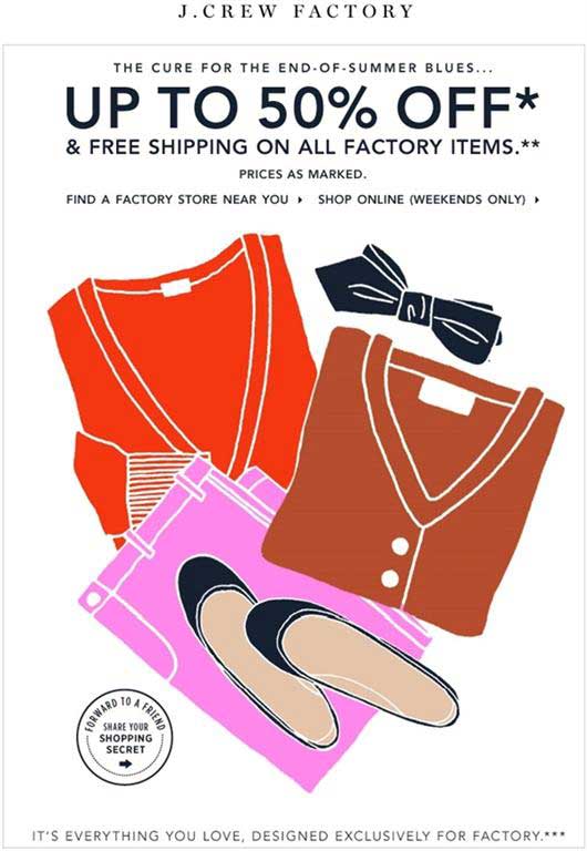
Just try this J. Crew email on for size to see what I mean:
* * *
We approach email with an incredibly short attention span, sizing up whether to open and act on messages in near sub-second timeframes. So for your email marketing, let clean, clear, simple, and to-the-point rule your design. Show as well as tell, and don't tell just in one way: Use subject lines, headlines, subheads, and message copy to tell, and tell again.
Clear, uncluttered email will gain the gratitude of not only your designer but also your customers.