Even the most attractively designed website in the world couldn't lure people into browsing and buying if those people can't find their way around the site's products or content. Poorly organized sites can make website visitors feel like they're lost in a complicated maze with no clear path to the end. When your visitors come to a website dead end, they may choose that moment to abandon your site and go somewhere else. In addition to costing you customers, a website with poorly designed navigation can also hurt your brand's reputation.
Thoughtfully designed and streamlined site navigation is key to showcasing your site's content, delivering a fruitful experience to your customers, and preserving your brand's credibility. Fortunately, it's relatively easy to improve your site's navigation with some simple changes and enhancements that won't require you to hire an IT team.
Here are some ideas to get you started.
Navigation Design
Let visitors choose how they navigate
Different people want to navigate in different ways, so give them several choices for how they can navigate around content or products. For instance, you can offer navigation choices relating to categories, brands, types of content (e.g., news, blogs), and age ranges/gender for products.
Offer refinements
Refinements allow visitors to narrow their search as they travel through your site. Category pages are usually broad. For example, visitors can search "birthday" or "holiday" on a children's party supplies site. However, you can allow visitors to choose from more specific product subcategories, such as "pirate," "princess party," or "Halloween party" to help them get to their desired content or products faster. On the other hand, don't offer too many refinement options. Visitors may become overwhelmed by all the choices and abandon your site.
Allow visitors to navigate throughout your site from any page
That may sound obvious, but visitors could start their experience on your site from almost any page, depending on how they got there. For example, typing in your URL takes visitors directly to your homepage, but a search engine could lead them to almost any page. Special offers or ads on another website could take them to a landing page. Also, a link on a blog or social media site could lead them to other areas of your site. Therefore, it's important to give visitors some context by showing them where they have landed on your site and to allow them to navigate to other pages, no matter which page they're on. Provide a navigation bar, and include it on all your site's pages so your visitors can easily browse from page to page without having to go to the homepage first.
Show site navigation results above the fold
When a visitor starts navigating, say, by clicking a category link, make sure that at least some of the results can be seen without the visitor's having to scroll down. Some sites show so many options at the top of the screen that products and content are pushed below the fold. Visitors may assume that they have to select another refinement, when, in fact, the product they're looking for may already be displayed below the fold.
Ratings and Reviews
Add ratings and reviews to product information
Ratings and reviews encourage visitors to click-through to and browse more content, and they increase conversion rates. Display the number of reviews for each product to illustrate which ones have reviews.
Allow visitors to sort by ratings
Much like sorting products by price or popularity, sorting them by ratings is a great option to offer site visitors because it will help them quickly find the products that are their top choices.
Provide options for navigating through reviews
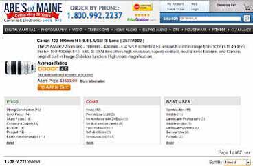
If some of your products have a large number of reviews, it can be cumbersome for your visitors to read through them all. Let visitors zero-in on the most compelling information in your reviews. Allow them to easily find positive reviews. For example, Abe's of Maine allows visitors to navigate reviews by pros, cons, and best uses, and to sort reviews by newest, oldest, highest rating, or most helpful. That feature is extremely effective, and it reduces the steps visitors need to take before making a purchase decision.
Refinement Display
Use a color palette to show color refinements
Visitors respond better to actual colors instead of the names of colors in text, and showing color options takes up less space. Showing a color palette can also reduce confusion about color names. For instance, the words "spruce" or "marine" may mean something different to you than to your customers.
Offer multiple ways to unselect refinements
You have many ways to help your visitors navigate back several levels when they have chosen refinements. You can use a "Show All" link or a breadcrumb trail that lets them return to a particular category page or higher-navigation level. Another idea is to use an "x" or check mark next to the selected refinements so visitors can easily remove a refinement selection without deleting all the selected refinements.
Consider using popular products or content as navigation images
Show an image of the most popular products or content types to provide a visual clue to visitors. For example, a children's clothing category could display an image for the most popular item in that category.
Merchandising
Rank products and content in ways that make sense for your business
Ranking products and content by popularity helps minimize the amount of clicks necessary for visitors to find what they are looking for. You can also show high-margin products or excess stock items first to help move those products.
Use banners to enhance navigation pages
Banners give your visitors a visual confirmation of their navigation location, indicating where they are in a product category. They're also useful for highlighting sales, special promotions, and popular products related to the navigation results.
Mobile Navigation
Make categories and navigation simple
Mobile sites have a lot less space to work with. Understand how visitors navigate on your main website, and use that knowledge to narrow down categories so you can feature only the most popular options on your mobile site.
Use drop-down menus for navigation
Since mobile devices have less space for navigation, you need to find different ways to present information. A good idea is to display refinements with a drop-down menu instead of presenting links. That will give users full refinement capabilities and save screen space.
Add a search box to the bottom of the page
When someone scrolls to the bottom of the page, they haven't been able to find what they're looking for on that page. Adding a search box and some navigation links to the bottom of the page lets them easily continue exploring on your site without having to scroll up to the top.


