As the father of exploratory data analysis John Tukey once said, "The greatest value of a picture is when it forces us to notice what we never expected to see."
That quote rings true in many aspects of business life, and especially within marketing operations. The technical, disciplined, and process-driven approach that marketing analysts attempt to drive into the marketing organization can clash with the more creative, right-brained mode of thinking that's so important to fundamental marketing.
Enter data visualization.
Although core data visualization techniques and concepts have been around for a while, and they have been preached by the likes of Yale professor Edward Tufte since the early 1990s, the Internet, Big Data, and changes in consumer behavior have made understanding and communicating quantitative insights in a timely manner a critical skill for marketers. Accordingly, data visualization is a truly fundamental new lesson to be taught in Marketing 101. (And, hopefully, you aren't sick that day, because this content will be on the test!)
Experts have written about how to portray data effectively, by using simple and informed graphs to reveal the story behind the data. This article focuses on how to apply data visualization techniques in marketing operations to make a real impact.
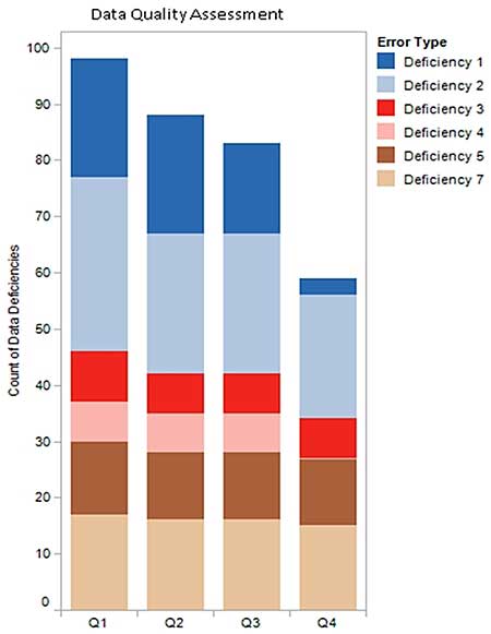
Data Quality Assessments
The old saying that people are a company's most important asset may no longer ring quite as true, especially within Marketing.
Matching a company's products and services to the people who need and want them requires excellent customer and prospect data. Often, marketing operations assumes responsibility for the cleansing and maintenance of that asset. Therefore, effectively communicating the strengths and weaknesses of that data to the marketing team is critical during campaign planning and measurement activities.
Accurately portraying the health of one's customer and prospect data also proves useful in conversations with the finance and IT departments. Time-series graphs depicting improvements in overall data quality over time, along with details as to the deficiencies (e.g., missing addresses) should work best to help users focus on what's important.
Also, illustrating the relative proportion of the deficiencies via bar/column graphs will highlight which issues still need to be dealt with or managed more tightly.
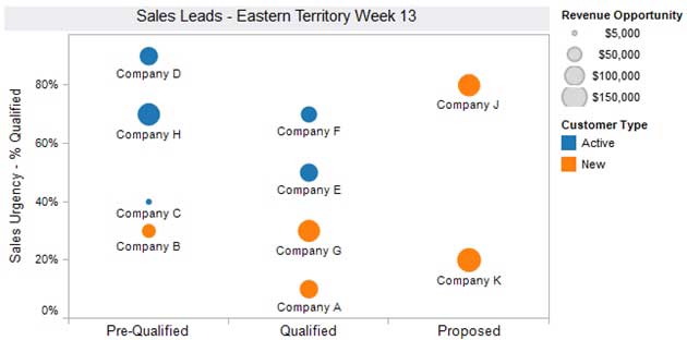
Lead Lifecycle Management
The results of marketing and demand generation efforts most often become visible in the form of sales leads. However, a sales rep is more likely to want to focus on closing deals in the pipeline than chasing leads. Finding creative ways to convey helpful information about those leads can produce higher close rates, making sales prospecting more effective and increasing marketing's credibility with the sales organization.
A bubble chart can communicate four dimensions of information about a lead:
- How close a prospect is to making a purchase decision
- The dollar value of the opportunity
- The stage in the sales cycle
- The customer type or product involved
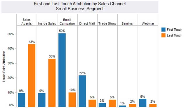
Marketing Channel Performance Reporting
It is difficult to quantify the impact of multiple marketing exposures and touchpoints preceding a sale. Not all organizations are at a point where data can easily be consolidated. And it's rarely clear how to attribute the sale—i.e., how important the first and last touch points are, and everything in between.
A picture, such as the following, can summarize the results of first-touch and last-touch marketing attributions, allowing the marketing analysts and executives to immediately see patterns that lead to success.
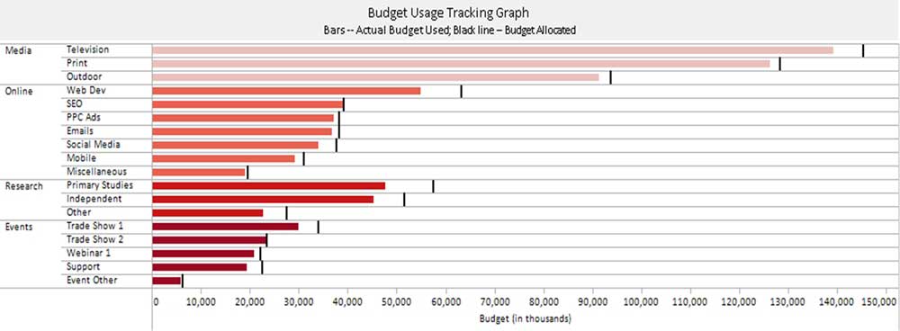
Campaign Planning and Budgeting
Visualizations that show the distribution of funds, especially all in one view, become far more powerful than the typical spreadsheet used by most marketing operations leaders.
As the year progresses, you will likely want to illustrate the rate at which marketing funds are being consumed. A bullet chart is most effective here as it shows two sets of data simultaneously—the budget and the actual spend to date:
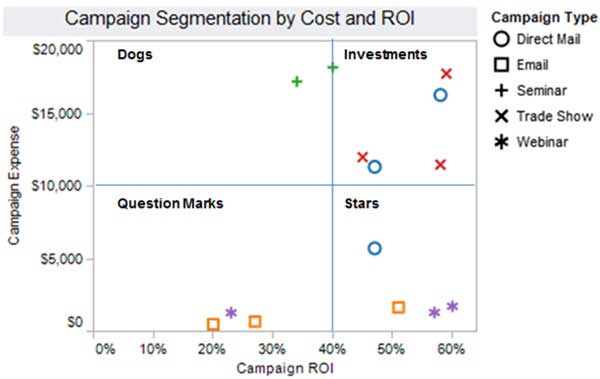
Marketing Return on Investment (ROI)
After viewing progress against marketing spend, the next logical question is whether these investments are paying off. The scatter plot is an effective method for portraying marketing ROI. Choosing marketing spend and the return on that spend as the plot's axes helps you to group the campaigns.
The following is a classic scatter plot divided into quadrants, with the leading campaigns delivering a big return for moderate spend:
* * *
These tips aim to effectively convey marketing operations ideas so that both aesthetic form and functionality go hand in hand.
The possible variations on these suggestions are innumerable, but there's no question that data visualization can help bring the quantitative side of marketing into focus, often with eye-catching flare.
And maybe a little extra flare is all that's needed to help bring the right and left brains of Marketing together to achieve great results.
The opinions and ideas expressed here are those of the authors and not necessarily those of their employers.