Website conversion experts boast about increases in conversion rate percentages. But what it really should come down to is money—revenue increases.
I mean, if you have 10 sales per year, and I help you get 11 sales per year, that's a whole 10% lift in conversion rate.
Sounds awesome, right? Not if you pay me $500 to do the job and your average order value is $10. At that rate, you're out of business and I'm out of a job.
In this article I'm using real numbers and giving you seven specific examples (which you can use) that helped me increase online sales by more than $21 million.
7. Email Remarketing
When SeeWhy issued its Top 10 Converting Websites report, one thing became obviously clear: The best websites in the world use email remarketing. We're talking websites that convert 40% of their website visitors.
When the report was first published in 2010, very few email service providers had rolled out an email remarketing solution as part of their functionality, and building a solution internally would take months... or years!
I tested it manually. I created the email copy, I hand-picked a couple of dozen visitors who had abandoned their shopping cart and sent the email from my personal inbox. The entire process took less than half a day.
We sent 25 emails. From those 25, 16 people went on to complete their order, leading to sales totaling $50,000.
6. Exit Popup
Collecting customer feedback is hugely important to optimizing your website.
We found the best place to start was to include an exit popup when a visitor was about to leave the checkout process. We asked, "What stopped you from completing your order?"
In a two-week period, we didn't receive many responses. However, one response was pure gold.
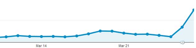
One shopper who had abandoned a cart told us that the "Continue to payment" didn't work on her iPad. And we averaged 4,000 iPad users per month. Ouch!
With a conversion rate between 8-10%, this fix alone was worth $60,000.
5. The Benefits
We first launched a Web page that outlined all products and then linked to the order process. For more than a year, that page sent close to 300 visitors per day into the shopping cart.
We wanted to do better and so we spent 10 minutes writing down the benefits of ordering online compared with ordering over the phone. Once we were happy with the list of benefits, we included them on the page and above the product links.
The benefits looked like this:
- It's free to book online (no additional fees).
- Online bookings are secured with our online booking guarantee.
- Ordering online is 100% secure (SSL certified).
- We have an easy-to-use booking system.
- We offer 24/7 customer support and live chat.
(You can copy those benefits and add them to your website.)
This change had an immediate impact. It increased the number of visitors who initiated an order from 300 to more than 880 per day, resulting in an increase of more than $93,500 in online sales.
4. Clean Checkout
Now that we had the "Continue to payment" button working for iPad users, we took another look at the checkout. But which page could we try to optimize first?
Using a model that is loosely based on the PIE framework from Wider Funnel, we analyzed high-traffic and high-value pages and identified which review page was the best page for conducting an A/B test.
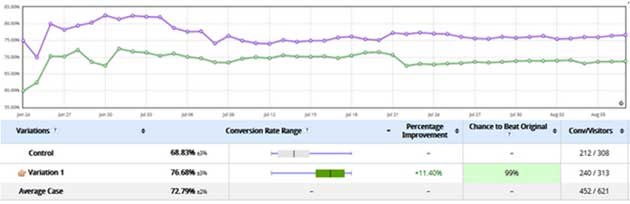
The exit rate was 31% on that page, so our goal was to decrease the amount of shoppers who abandoned the site—which meant cutting down the number of call-to-action buttons from nine to two.
Using VWO, we let the test run for more than 45 days.
The winning variation was the clean checkout variation, which resulted in an 11.4% increase in conversion rates, at a 99% statistical significance level. The change meant an additional $100,000 per year in sales.
3. Clear Call to Action
Make your CTA big, bold, and bright. That's what you've heard, right?
Hello bar is exactly that. It's a visible bar at the top of your website and it's an incredibly simple idea that has worked magic for us.
We tested Hello bar on the blog to begin with and registered an immediate increase in leads. We then went one step further and launched it on the homepage, which also had a positive impact.
Finally, we launched Hello bar across the entire site. In 10 months, it's generated more than 1,100 leads. At value of $150 per lead, that's $165,000 right there.
It took five minutes to install, $30 per month, and a return of $165,000. It's simple yet highly effective.
2. Purpose of Visit
Why do people visit your website? Do you know?
I'm guessing you probably do know, but the best way to find out is to ask them.
A survey tool widely recommended by Avinash Kaushik provides the visitor with a few simple questions:
- How did you rate your experience?
- What best describes the purpose of your visit?
- Did you complete the purpose of your visit?
Through dozens of responses, we found that most visitors (40% who completed the survey) were looking for pricing information. And though pricing information was visible on the product pages, we created a pricing page that lists all pricing by product (with links) and included the page in the main navigation menu.
Within six months of launching the page, it received more than 60,000 visitors and initiated hundreds of new orders at a value of more than $300,000.
1. Key Functionality
In 2008, Forrester Research released a report titled Small Website Investments That Pay Off. It focused on low-cost Web activities that can have a strong impact on your bottom line.
Through two years of hard work, prioritization, and site usability tests, we finally managed to get to the biggest impact investment: Put key functionality on the front page.
Our key functionality was a booking box, which meant that visitors could initiate an online booking from the homepage of our website. Here is an image of the homepage before the change (at left) and after the key functionality was implemented (at right):
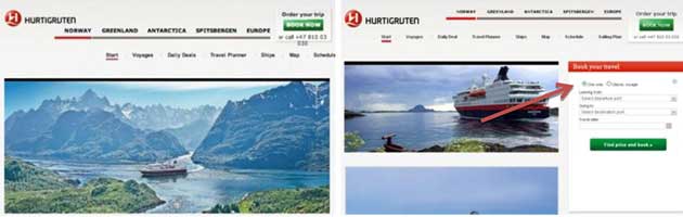
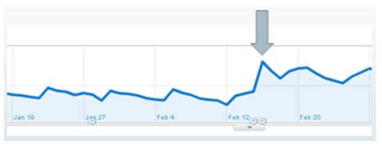
Placing the booking box on the homepage had an immediate impact and sent initiated orders through the roof with a 193% increase overnight!
That one change alone is worth $20.1 million to the business; through continuous optimization and testing, it helped grow online sales by more than $100 million per year.
Conclusion
That's seven tips and more than $21 million in additional online sales.
Those high-impact tips will increase not only your conversion rates but also your profitability. So this is not just conversion rate optimization but profit statement optimization.
What high-impact tips or case studies do you have that you can share?