Let's start with a question. What's one recent article that made a big impact on you? For me, it was Nathan T. Baker's blog post, "My Content Only Went Viral After My World Collapsed," on Inbound.org. I remember sitting at my desk at work, blinking back tears, totally floored that someone had shared such a personal and heartbreaking story on a marketing forum.
The thing is, stories have power. If they're meaningful, they can touch something deep inside of us. We carry them long after we're done reading. They materialize at random moments, ghosts of another reality that's just one step sideways from the one we inhabit.
Our challenge as marketers, particularly on the B2B side, is that we live in a world powered by stats and facts instead of stories. Our prospects want hard data proving our products and services will be worth their investment. They're hungry for stats that point to broader industry trends. They want quantifiable ideas they can use to support their business objectives.
So it's no mystery that data visualization has taken off in a big way in the content marketing community, since people tend to be visual learners. But how does that mesh with storytelling?
I'll let you in on a little secret. The key to great data visualization isn't a pretty design or clever concept: it's a great story. And it's actually pretty easy to tell a compelling story backed by stats and facts.
Let's explore how to create a story-driven data visualization, step-by-step.
Step 1: Review your data set
When creating an infographic, the obvious place to start is your data set. Depending on what your data says, your story can go in various directions.
Some questions to ask when looking at your raw information:
- Does any of the data surprise me?
- Does any of the data point to a larger trend?
- Are there any recurring themes?
- Are there any key characters or players in this data?
Answering those questions will help you identify the most important "plot points" in your data—and story.
Step 2: Tease out a story
Once you have a sense of what's interesting about your data and where it's taking you, the next step is to tease out a story.
Often, that's just a matter of taking the plot points and characters you've identified in Step 1 and tying them together with an overarching story arc. Other times, it may involve coming up with a creative story to wrap your data points in, in a way that appeals to your audience.
For example, I recently worked on an interactive infographic in partnership with visual content creation company Visage. The raw information—figuring out the best visualization option for your data—was interesting, but a bit difficult to grasp, especially for non-data-sciency people like me.
To make it more relatable and to ground the examples in the real world, I came up with the overarching narrative of a marketing newbie who attends his first conference and how many drinks he consumed over the course of the week.
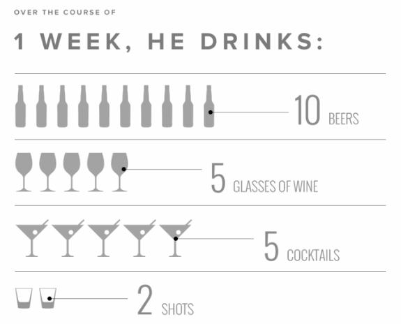
A good example of a story-driven data visualization
Step 3: Develop a narrative framework
Now that you have a story and data to flesh it out, it's time to build out a narrative framework for your content. Depending on the format you use to convey your story, your process will vary a bit, but the general approach looks something like this:
- Outline your sections.
- Draft copy for each section to frame the data and move the story forward.
- Identify which data points or facts are most important.
- Then go back to the beginning and craft a compelling introduction that lays the groundwork for your piece.
If you're developing an interactive data visualization, you'll also need to determine which portions of your content will be shown in your base layer of content, and which ones will be hidden in a secondary layer that requires the viewer to drill in with a click or rollover. This infographic from Salesforce does a nice job of providing a clear story with rollover stats in a secondary layer.
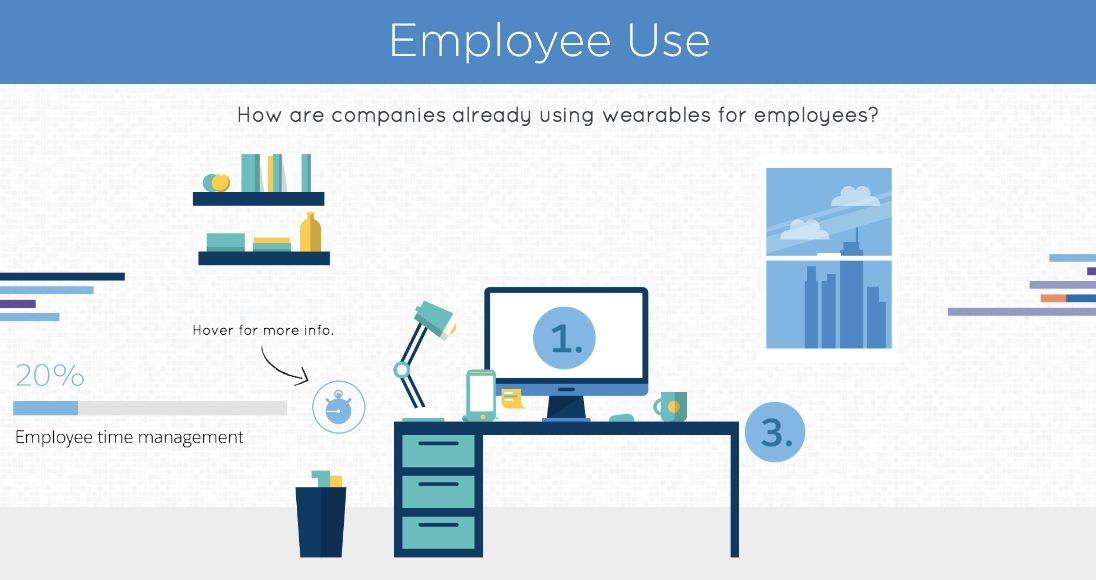
Viewers are invited to hover over objects to view related stats on employee use of wearables
Step 4: Choose your data visualization formats
Depending on the type of comparisons you want to make and the data you're working with, you'll need to select a visualization format.
Four of the most common types of data relationships are...
- Nominal comparison: Used to compare sets of data in no particular order
- Part-to-whole: Used to compare individual data points to a whole data set
- Ranking: Used to compare categorized data using a specific measurement
- Time series: Used to compare data by time
Once you identify which type of relationship you're dealing with, you'll be able to home in on the data visualization formats you'll be able to use. They can range from simple to complex displays, including the following:
- Line charts
- Bar charts
- Stacked bar charts
- Pie charts
- Area charts
Step 5: Make something awesome
Once you've done all the legwork on your stats, story, narrative framework, and visualization formats, it's time to make something awesome! You'll need to work closely with your creative team to ensure the concept and execution really drive home your narrative, without being too dry or technical.
I particularly love the way Red Bull approached data visualization in an infographic on its Texas Air Race. It managed to convey hard facts in graphs while involving pictorial elements, which makes the information a whole lot more engaging and interesting.

This graph combines statistics with graphical elements for a fun, informative data visualization
* * *
Data visualization doesn't have to be scary; in fact, it can actually be highly creative and narrative. With the right approach, you can turn raw numbers and facts into a super-engaging story that will draw readers in while also presenting useful information in an intuitive way.