Let's start with a story.
To analyze the effectiveness of its TV commercial storyboard, Makro, an international digital and in-store retailer, asked neuroscience research firm Neurensics to conduct an f-MRI study to determine people's reactions. The experiments showed that the storyboard scored lower than average in effectiveness: "It activated more negative than positive emotions. In particular, the storyboard did not activate decent levels of trust and expectation. The overall result was a negative score on influencing buying behavior."
The experts' advice to Makro was to eliminate the scenes that provoked anger and rejection, to mention the company's end-value, resolve some elements of the plot, and add music with a climax.
The TV commercial based on the optimized storyboard provoked more positive feelings in the audience, according to the Neuromarketing Science and Business Association (NMSBA). The result of Makro's trusting in neuroscience to enhance its advertising activities was a 12% increase in sales compared with the same period in the previous year.
That story is a small example of what neuromarketing can do for marketing.
Decision-making happens in seconds, without any general mechanically calculable pattern. Any visual detail of your branding activities can influence your customers' decision-making process.
The challenge that brands are confronted with has to do with the probable effect each detail has on the human mind: An ill-suited color (however minor), misplaced text (however clear), or a miscalculated name (however meaningful), could have the most negative or nerve-wracking effects on people.
So here are four neuromarketing hacks to boost your branding efforts.
1. Pay attention to time-space representations
What if your brand aims to convey a sense of time? Some brands want to look established and traditional, whereas others wish to seem modern or even futuristic. Choosing your place in the time continuum means using suitable visual representations of time (check out this research, "The Future Looks 'Right': Effects of the Horizontal Location of Advertising Images on Product Attitude.")
Time-space schemas are culture-specific: Cultures that write from left to right seem to proceed in time in the same direction. An ad that contains left-hand-side pictures conveying the concept of past and the right-hand side pictures with the concept of present or future is processed much easier in an English speaker's mind.
Elements aiming to make an impression of the past should therefore be placed on left-hand side of ads or other content. The items on the right side of the screen might convey an impression of present or future benefits.
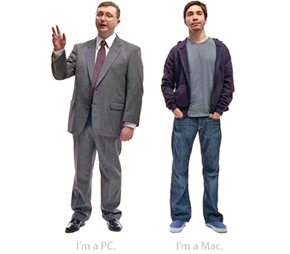
Here is an example: Most people remember Apple's famous Mac vs. PC ad campaign. The PC man with his oldish clothes is standing on the left, and the brand new cool Mac youth is standing on the right side of the screen. By presenting the old on the left and the new on the right, Apple is invoking the prevailing left-to-right time-space schema in the minds of its English-speaking audiences.
Also check out a recent infographic for Google's accelerated mobile pages (AMP) project. The old red car, representing non-AMP websites, is shown on the left side of the screen, implying slow movement, whereas the modern blue car representing the websites using AMP is depicted on the right side, denoting speed and forward movement.

2. Use diagonals intelligently
Horizontal, vertical, or diagonal? Each has an impact on the mind of your audience. Orientation of the items in your brand logo, or ads, is way more important than you might think, especially when you also use text in the logo.
Check out this neuroscientific hack: Use upward diagonal direction to imply activeness, youth, or energy, and use downward diagonal orientation to imply a state of inactivity or relaxation.
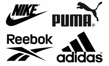
This consideration is even more crucial if your brand logo, or ad graphics, actually makes a choice between the state of being active or inactive. Normally, sports brand logos favor activity and therefore have more potential for upward diagonal designs.
Some of the most popular sports brands such as Nike, Puma, Reebok or Adidas use upward diagonal elements in their logo designs:
3. Find out what incorporates visual saliency
The human visual system has a limited area for its focus of attention. When we see a picture for the first time, our focus of attention goes to its salient details in less than a second. This minuscule engagement period is sometimes the distinguishing characteristic of an efficient branding activity.
From brand naming to packaging and shelf ordering, visual saliency can make your business the one that stands out among a crowd of other brands. Research finds that "marketing practices, such as the color of packaging or how the store shelf is lit, could have a sizeable impact in individual decisions even when those practices are not correlated with the consumers' preferences."
To explain the mechanism of attention, we can consider two types of saliency: bottom-up and top-down. In bottom-up visual saliency, the stimulus is the only source of reaction, whereas in the top-down visual saliency, the stimulus invokes some kind of memory in the respondent's mind and thus has a deeper effect.
Whether with a bright color or a dark one, a complicated pattern or a simple shape, visual saliency depends on the surroundings of the object in the bottom-up type. Top-down saliency, on the other hand, might convey a broad range of emotional and cognitive implications and so take more time to be effective.
Let's consider the new Instagram logo as an example. Darren Bridger explains some neuroscience aspects of the new logo. He says the move from a skeuomorphic logo to a modern, abstract one with high contrast with its background (a bottom-up salient object), and various layers of connotational meanings (making it a top-down memory-invoking salient object) will have long-term positive consequences.
![]()
4. Take advantage of corresponding sensory modes
Orange is a warm color, whereas blue invokes a sense of coldness. A song might be sweet or bitter. Smoothness is associated with serenity, while ruggedness might be associated with violence.
A study finds that customers have a better shopping experience when such sensory inputs correspond to each other: "For example, the scent of lavender combines well with slow-tempo music (both low-arousal), while the scent of grapefruit combines well with up-tempo music (both high-arousal), than when the level of arousal of the stimuli did not match."
Another study reports that the perception of a product's weight has a direct correspondence to its color's lightness: A light color conveys a light weight, and a dark color conveys a heavy weight. The color itself did not have any influence on the perceived heaviness of the product: For example, there is no difference between the perceived weight of a red product and a blue one; only a light blue or light red product is conceived lighter (in weight) than a dark blue or dark red one, for instance.
The same study claimed that the location of product images has a relation to their perceived weight: A product image that is placed in the bottom (especially the right-bottom) of the visual field (on a product's packaging, for instance) is conceived as heavier than one placed at the top.
* * *
So if you're in the same boat with people who think that branding is all about making your products more consistently appealing to your customers, you should think of brain science as a boon to your branding philosophy.
Understanding neuroscience principles is also a prerequisite for business success, considering that over 90% of our decision-making process is non-conscious and totally out of our control.
So use these four neuroscience hacks to target the non-conscious part of your customers' brains and enhance your branding efforts.