As the quality of digital experience improves, the value of creating passionate users is becoming clear to brands wishing to thrive in the "experience economy." Provide an experience that is useful, usable, desirable, and differentiated... and you will create demand for your brand and delight your customers.
But if passionate users (or customers, or consumers) is the "WHAT" (the end result that we aspire to attain), then what about the "HOW"—the role that design plays in all of this? And I'm not just talking about visual design. As designers of digital experiences, what are we doing to develop compassion toward the users we are designing for?
OK, if you are going to get defensive while reading this article, now might be the right time. If you are an Interaction Designer, you probably feel that your whole existence is dedicated to meeting the wants and needs of users. If you are a Visual Designer, you might feel that you possess heightened sensitivities that allow you to be more "empathetic" while designing for your audience.
If you feel you are doing all you can to be a compassionate designer, then there is no need to continue reading. But if you think you can do more—read on.
I have this theory. My theory is that when we feel that we get really good at something, when we begin to consider ourselves "experts," that is when we are at risk of losing (or de-emphasizing) our compassion for the customer—the people we design for.
Think about it this way. It happens to doctors, the people who swear to uphold Hippocratic oaths, the same people who sometimes hold the key to life or death. When a surgeon gets really good at his or her craft, sometimes compassion takes a back seat to the otherwise honorable goal of saving lives. Sometimes, bedside manners become compromised in the process of moving on to the next patient. It's not intentional or out of malice—it just happens. All professions are vulnerable. When we get really good at something, we're tempted to think, "I've done this hundreds of times—I know what I'm doing."
We are tempted to think, "This is my area of expertise."
That's true of usability and interface design, visual design, motion design, copywriting, marketing—all of the above. Let's be honest with ourselves. How many times have we made a design decision that was in the interest of winning an award rather than winning over the customer? Or how many times have we included a deliverable because it validated our role as opposed to validating the life of a consumer?
We've all done it. Oh, you haven't? Liar.
What exactly does it mean to be a compassionate designer? It means doing things that help us not only understand but also relate to the users we design for. To feel for them. To put ourselves in their shoes, even if our own lives are totally opposite from theirs. Sound simple? It is. You just have to do it.
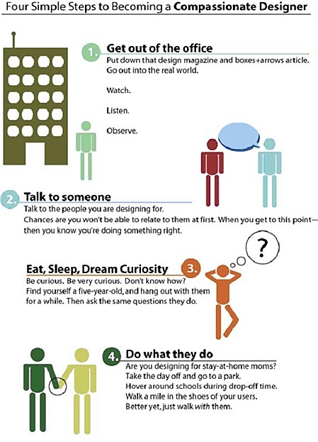
Here are four practical ways we can develop compassion for our users:
- Get out of the office. Put down that design magazine and boxes+arrows article. Go out into the real world. Watch. Listen. Observe.
- Talk to someone. Talk to the people you are designing for. Chances are you won't be able to relate to them at first. When you come to that realization—then you know you're doing something right.
- Eat, sleep, dream curiosity. Be curious. Be very curious. Don't know how? Find yourself a five-year-old, and hang out with them for a while. Then ask the same questions they do.
- Do what they do. Are you designing for stay-at-home moms? Take the day off and go to a park. Hang around schools during drop off time. Walk a mile in their shoes. Better yet, just walk with them.
Several years ago, I found myself in a spirited discussion with my creative director over a design we were proposing for a large B2B distributor. The design was minimal. It was all about speed and efficiency. It was designed for people who didn't want to spend a lot of time ordering supplies and had better things to do with their time. It was designed for the type of person who could not care how many times you told them "we're here to help". It was designed for someone who needs proof, every day. "You want to help me? Make it easy, fast, and reliable."
But my creative director didn't like what he was seeing:
- "Where's the value proposition?"
- "Where are the pictures of people being helped?"
- "If I'm coming to this Web site for the first time, I have no idea what this brand stands for"
All noble concerns. Only one problem: He didn't take the time to get to know the customers. He felt he knew them. He made assumptions about them from everything he thought he knew in his career (and personal experience), but he never even asked me about them. I toured the distribution centers, attended scores of user tests, and made the effort to reach out to every contractor I could get my hands on. Luckily, I had a couple in my family.
The design direction in many ways went against my personal preferences. It was visually appealing but lacked a "story." It did so because I knew in my heart that the best story we could tell these customers was to not tell them one at all. The most compassionate thing we could do was show them the story.
But this wasn't only about the customer; it was also about the brand.
The brand stood for "getting the job done." And that's just what the site did. The fact that it lacked "lifestyle" imagery only reinforced to users that the site "understood" them. It wasn't talking to them about helping. It was doing it with very little lip service. Which is exactly what they needed to experience.
If we feel for the people we design for—we will do what is in their best interest. And that is being a compassionate designer.