Stauer is a well-known direct marketer, selling everything from jewelry and watches to coins and collectibles. The tagline on its website reads: Smart luxuries–Surprising prices.
Its reproductions of fine art can sell for hundreds of dollars, and its rare collectibles can be priced above $1,000.
Most of us, though, are familiar with its glossy page ads, selling Stauer-branded watches and jewelry at a price point typically no higher than $50.
Which brings us to today's What's Wrong With This Picture ad critique: Stauer's Compendium Hybrid watch. And that right there is the ad's first goof: product branding.
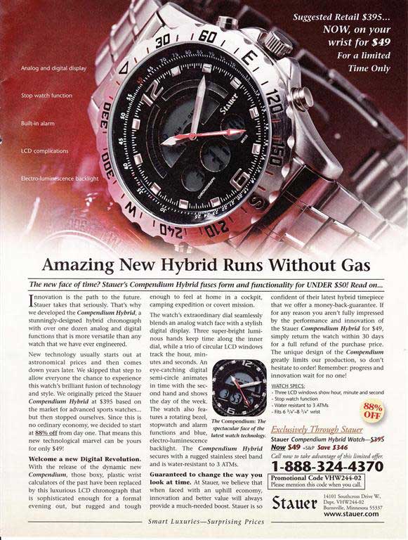
If ever there were a product name that gave you no clue as to what the product is, it would be Compendium Hybrid. I can see General Motors (GM), or maybe BMW, tacking that moniker on a luxury hybrid SUV, but on a watch?
The moniker also violates the KISS principle. Compendium is neither a simple word nor an intuitively understood one. Compendium means a comprehensive but brief account of something otherwise extensive. But how does that apply to a watch? It doesn't... at least, not effectively.
More to the point, would you be comfortable telling anyone who inquired about the watch (if it were on your wrist), "Oh, this ol' thing, why it's my new Compendium Hybrid"?
How much easier and simpler would it be to say, "It's my new Stauer chronograph"?
Now, let's review the ad from top to bottom
The pricing information is located in the upper right-hand corner of the ad. I would submit, subject to testing of course, that the tried and true (and now extremely tired) approach of telling the consumer that an item is offered at a deep, deep discount compared to its normal price, is a bit overdone and dated—especially if the item has never before been offered anywhere at any price. Such copy serves only to activate the reader's BS detector, if the reader has been around long enough to acquire one.
Also, using the generic, non-specific phrase "For a Limited Time Only," reinforces the notion that the marketer is pushing the envelope of the audience's credulity.
I think a more creative approach to urgency and "reason why" pricing would be more effective (read believable). For example, why not call it a limited edition? Why not tell consumers that only so many watches have been made, and that once they're gone, they're gone?
Granted, Stauer wouldn't want to stop selling the watch, especially if it proves to be a big seller. In that case, Stauer can make some feature of the watch (e.g., the color of the watch face) a never-to-be-offered-again option.
OK, moving along...
To the left of the watch graphic (no problem there, but I'm not a designer) is a brief feature list. Now, I'm not sure if it was overlooked during editing, but the feature "stopwatch function" sounds a bit awkward. The copywriter might have intended for the copy to read "stopwatch functionality." But even that is clunky.
And the real boner is "LCD complications." I don't buy many watches with an LCD display, but I've never seen one characterized as complicated. That's not exactly a strong or appealing selling point.
Now for the headline...
Cute is not clever, and clever is not smart marketing
Borrowing ineffectively from the hybrid zeitgeist is one thing, but stating that this watch doesn't need gas is really pushing the marketing IQ needle toward empty. Cute and clever headlines are what many branding agencies use to justify their inflated pricing. But if a headline doesn't do what it's designed to do—compel the reader to keep reading—it's a waste of someone's money.
After all, we know Stauer is selling a watch, and we know it doesn't run on gas... so what's the point? And throwing in the standard "Amazing" is just trite. I mean, is it really amazing that this watch doesn't need gas?
The subhead is fine, but why make the first sentence a question? It would be far more impactful if it were declarative (i.e., a period instead of a question mark).
Does the body copy have a pulse?
The first paragraph of the copy is, more or less, about Stauer and how brilliant it thinks its designers and engineers are. But, who cares? Similarly, copy that tells, but doesn't intimately involve the reader, especially in the lead paragraph, will not do what any paragraph of copy is designed to do: get the reader to read the next paragraph.
A takeaway point to remember is showing trumps telling. And talking about the reader trumps talking about the product and the marketer.
Now, the second paragraph of the copy is a bit of a jigsaw puzzle. The copy starts out with an explanation of how new technology, in general, is priced. Then, it reminds the reader that the watch is priced at a deep discount, goes into the state of the economy, and mentions why the price is discounted. All of which might be good points to bring up, but not in one very long paragraph.
A paragraph should be devoted to one idea, and one idea only—fleshed out and explored from beginning to end. Throwing three or four relatively disparate thoughts into one paragraph is akin to giving the reader visual and mental whiplash.
OK, the third paragraph, as often is the case, is where the sales copy actually begins. The first few paragraphs are typically where the copywriter begins to warm up to his message, and therefore, they should be immediately deleted once written.
Best of all, in the third paragraph, the copywriter tells a story—which is always a great way to grab the reader's attention and interest.
The only problem is the subhead that starts the third paragraph doesn't deliver on the claim it makes. In other words, where's the revolution the reader is being welcomed to?
The fourth paragraph is OK. It draws a picture of how the watch works. Yet, it would be stronger if the copy also connected the watch's features to its advantages and benefits. The fourth paragraph starts with another somewhat-problematic subhead: "Guaranteed to change the way you look at time." That's not exactly an explicit guarantee you can take to the bank. After all, what does it mean exactly?
Again, I think the copywriter is just trying to be cute—attempting a play on words, as in, Yes, if you look at the face of the watch and all its displays, you'll be looking at time differently (maybe cross-eyed, I suppose). Bottom line, it's an empty statement that distracts the reader from the momentum the copy had been laboring to build.
Worse still, the paragraph starts off with a one-sentence nod to the economy (again), before heading into a pro forma guarantee. And it all ends with a feeble attempt at implied urgency: "Remember: progress and innovation wait for no one!"
OK, my final thought: Because the watch sells for just $49, I guess Stauer feels you're entitled only to $49 worth of sales copy. Too bad. I'm generally a fan of Stauer's ads.


