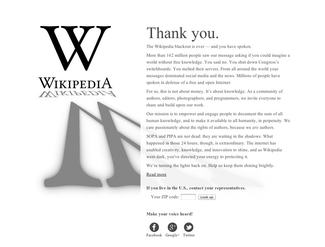
Using a landing page (see image, below), Wikipedia thanked its readers and the online community at large for taking part in the Wikipedia Blackout protests against two proposed laws in the United States Congress: the Stop Online Piracy Act (SOPA) and the PROTECT IP Act (PIPA).
At the bottom of the landing page, Wikipedia urged readers to enter their ZIP code in order find their US representative and contact them to vote against the bills. It was an effective call to action: More than 8 million people filled in their ZIP code, and 3 million ended up emailing Congress to oppose the bills.
SOPA and PIPA were effectively stopped in their tracks as lawmakers scrambled to appease the public and join in denouncing the proposed legislation.
But the interesting thing about the landing page is that it wasn't optimized. Wikipedia's quick "thank you" note could have been improved in various tested ways that might have gotten even more readers to find their representatives and investigate further.
Although there are hundreds of tried-and-true conversion optimization methods for improving landing pages, let's discuss seven of the most basic—and powerful—ones.
1. Keep it short
Wikipedia was going for a personalized, heartfelt letter, which makes sense in relation to the nature of the call to action and the audience. Still, it's 208 words long (including "Make your voice heard!" at the very end).
I'm sure Wikipedia hired a professional writer to pen that note, but did the writer take into consideration the optimal length for a landing page? The letter might have looked great on a single page, but did the writer know that the Wikipedia logo would take up half the page?
Length is inversely proportional to click-through rates, and a landing page is the one place you want shorter, tighter copy. Here's how Wikipedia could have shortened the letter and increased engagement (in 147 words):
Thank you.
The Wikipedia blackout is over—and you have spoken.
We asked if you could imagine a world without free knowledge. You said no. You shut down Congress's switchboards and melted their servers. Your messages dominated social media and the news. Millions of people around the world spoke up in defense of a free and open Internet.
But make no mistake—SOPA and PIPA are not dead. They are waiting in the shadows. We must remain vigilant.
This has never been about money for us. It's about knowledge. As a community of authors, editors, photographers, and programmers, we invite everyone to share and build upon our work. We care passionately about the rights of authors because we are authors.
We're turning the lights back on. Please help us keep them shining brightly.
Read more
Contact your US representatives.
Your zip code:
Make your voice heard!
2. Use bullets
Another thing Wikipedia did not do is use bullets to spruce up the copy. Bullets increase white space and make blocks of text less intimidating and more inviting.
Let's see that letter again (in 152 words):
Thank you.
The Wikipedia blackout is over—and you have spoken.
We asked if you could imagine a world without free knowledge. You said no.
- You shut down Congress's switchboards and melted their servers.
- Your messages dominated social media and the news.
- You, and millions of people around the world, spoke up in defense of a free and open Internet.
But make no mistake—SOPA and PIPA are not dead. They are waiting in the shadows. We must remain vigilant.
This has never been about money for us. It's about knowledge. As a community of authors, editors, photographers, and programmers, we invite everyone to share and build upon our work. We care passionately about the rights of authors because we are authors.
We're turning the lights back on. Please help us keep them shining brightly. Here's what you can do:
- Contact your US representatives.
Your zip code: - Make your voice heard!
Now be honest: Isn't that easier to read?
3. Include testimonials and case studies
Another reason to use bullet points to highlight what readers did in response to Wikipedia's message is that Wikipedia did not use a testimonial or quote on the landing page. It does exist indireclty—in the form of reader responses (i.e., "You shut down Congress's switchboards and melted their servers"), but it isn't immediately obvious as being a testimonial.
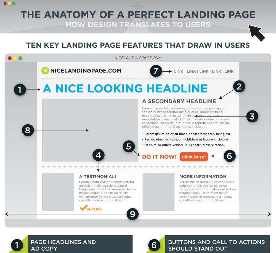
Effective landing pages make use of testimonials and case studies. Kissmetrics even includes them prominently as one of 10 key landing page features that draw in users:
4. Place a prominent call to action above the fold
Wikipedia got this one half right. It included the call to action above the fold (the point at which a reader would have to scroll down the screen to keep reading). But, strangely, all the CTAs are understated. I don't really want to click on that "Read more" or to bother aiming my mouse at that tiny ZIP code box. What gives?
There may have been a legal reason for that decision, but, in general, it's not a best-practice. CTA boxes should be loud, proud, and urgent (like the one in the Kissmetrics example).
Landing page copy is so crucial that a single word can double CTR, and the right contrasting color (which I'll go over next) can also make or break the sell.
5. Use contrasting colors
Despite what many marketers may think, color psychology is not static. Depending on the context of a page, red can be be a great color for a call-to-action button. In the following example, the red button increased conversions 34% compared with the control green button over 600 visits.

HubSpot ran a similar test with green and red buttons over 2,000 visits and found a 21% increase in favor of red as well.
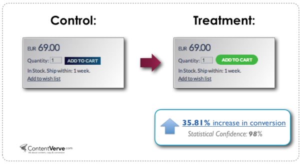
But that's not to say that green buttons are a bad idea. In the following example, the green button increased conversions nearly 36%:
In the end, though, it's not the color itself that necessarily matters; what matters most is whether it contrasts with—and stands out from—the colors around it on the page.
That holds true for landing page design as a whole: Wikipedia's classic black text on a white background works because it follows that principle.
6. Prominently display your logo
Wikipedia gets points for making its logo absolutely huge. The whole "social action casts a long shadow" theme is perfectly suited for the large W and adds gravitas to the page.
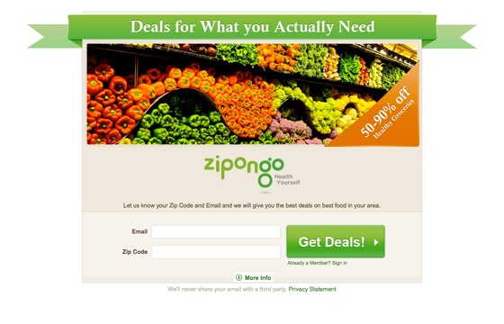
All 35 of the landing pages in Unbounce's post on landing page design examples prominently display logos. Here's a good example:
7. Include a video
Most landing pages could benefit from video.
I know, I know: video doesn't grow on trees. It costs a lot, and it may not be worth the effort, especially when you're already paying for A/B testing and have tight turnaround deadlines. But let me reiterate that short-form videos don't cost nearly as much as you probably think (especially whiteboard videos), and they can be made quickly.
Video marketing is also proven to convert: Video can increase landing page conversions 80%, according to a study by eyeviewdigital.com.
Unbounce covers five brilliant landing page videos in this post. Here's one of them: