We hear the same advice about website optimization over and over again: A/B-test your main call-to-action buttons, optimize your forms, and test different landing pages.
Here I'll explain 10 lesser-known optimization methods that can make a huge impact on your website.
Over the past year, my team at Oribi examined more than 150 B2B sites, tracked their key metrics, and analyzed which changes affected their conversion rates. These are our findings—a list of proven optimization methods and ways to test each one.
1. Remove your website's main menu from some pages
When building a website, the top priorities are usually highlighting the brand, creating the right flow, and maintaining consistent visual language. However, in over 70% of the cases we analyzed, using a lighter version of the main navigation bar—or completely removing it on strategic pages (such as features, pricing, or whitepapers)—helped increase the number of signups and other main objectives.
The psychology behind this change is that focusing visitors on what you want them to do helps prevent distraction and unwanted flows. For example, you don't want a user who just completed the product tour to enter the blog instead of signing up for a trial.
Measure it: To track the results of this change, follow the conversions on the pages you've changed as well as the overall number of conversions.
2. No one uses the "Contact Us" page
A common belief across most industries is that the "Contact Us" page is one of the most important pages of a website. It often gets a very attractive spot on the site at the expense of other pages. But the reality is that very few visitors actually use the "Contact Us" page, making it a wasted use of space for most sites. It's much more beneficial to display another page and offer an email address as a contact option instead.
Measure it: If you have a "Contact Us" page, look at the page visits—and the quality of those visits—compared with your overall page visits to see whether you really need it.
3. A/B-test your pricing page
More than half (56%!) of site visitors who sign up for B2B services visit the pricing page before converting. Most A/B tests focus on the homepage and landing pages, but the pricing page remains relatively static. However, we found that changing the pricing page had the highest impact.
Consider the following parameters, which are likely to move the needle:
- Focus on the main benefits per plan. Listing as many features as possible can lead to messy pricing pages.
- Try changing the default plan. UX recommends highlighting a default plan, which is usually the midrange price. But changing the default plan teaches you a lot about your users and may lead to surprising results.
- Rename your plans. Plan names are usually drafted once and never revisited again. Naming them differently may influence your visitors' decisions.
Measure it: Compare a few days' results of an updated pricing page with your standard numbers. If you keep your changes, think about adding a cohort and tracking the churn as well. Don't compare only the end-of-funnel results (paying users); also track how the initial plan visitors interact with the modified pricing page. Measuring more stats will help you understand the impact faster.
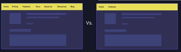
4. Use two main calls to action, side by side
The rule of thumb is to always use one main call to action. But deciding which objective will be the main call to action can be challenging. You may want your users to sign up, but having them take a tour might be just as important.
We analyzed a few dozen sites offering two main call to actions, such as these:

In 57% of the cases, we found an increase in conversions for both buttons. In 20% there was hardly any change, and in 23% the number of conversions decreased.
 In most scenarios, different types of visitors responded positively. The first call to action addressed more decisive visitors, encouraging them to sign up. The second call to action addressed "newbie" visitors, offering more information by taking a tour or watching a video. Although those options were available before as well, placing them as calls to action made the difference, illustrating that including a "learn more" call to action along with the main objective is a great way to convert different types of visitors.
Measure it: The easiest way to measure this change is to use any A/B testing tool (such as Optimizely). In addition, you can track whether users who picked the secondary call to action were more likely to convert during the same session or future visits.
5. Your blog's main call to action shouldn't be "subscribe"
It's reasonable to assume that your blog visitors want to stay connected and receive future posts to their inbox. That's why most blogs use their main call to action to get visitors to subscribe. However, another call to action probably performs better.
Our analysis found that "subscribe" leads to only a 0.1-0.5% conversion rate, while a "download" or "sign up for trial" call to action at the same spot results in a 2-4% conversion rate. If you are not ready to give up your "subscribe" call to action, this is the time for you to try two main calls to action (see tactic No. 4).
Measure it: Create a UTM link for your call to action, then track the conversions you get from that link.
6. Test the layout and timing of popups
Popups account for a significant number of leads. Their standard optimization paradigm is to change the image, calls to action, and even the concept. However, the highest impact we've identified is changing the layout and display method: Will the popup appear on the entire screen or just part of it? The full-screen popup usually leads to higher conversion rates.
In addition, how many seconds or pages after the visitor entered the site does the popup appear? Test a shorter threshold before displaying the popup. Real-world data shows that displaying the popup after 15- 30 seconds often generates better results.
Measure it: Simply measure the conversions coming from a popup dialog and compare them with the previous period. To separate the registrations coming from the popup and other locations, you can use Oribi, a simple event tagging tool that shows you where each contact comes from (or another tool). In addition, you may want to create a cohort to test the quality of users the more dominant popup accounts for.
7. Some people still like downloading PDFs
This finding is straightforward and does not come with big changes, but it can still be relevant for you. With information available online everywhere, PDFs don't seem as relevant anymore. However, it might be the psychological effect of actually receiving something that explains why 11% of visitors download PDFs from a site. So if you have one on your site, keep it there.
8. Build a more aggressive blog
B2B companies tend to keep their blog as nonpromotional as possible, worried that people won't read it if they push the brand too much. One of the main queries we ran on the batch of B2B sites was about the correlation between blog readers and conversions. Unfortunately, there seems to be a very low correlation between repeat blog visitors and their likelihood to sign up for the product.
People may like your blog more if you don't highlight your brand, but that won't lead to future conversions. Dialogs and banners that refer to your site will probably lead to better content marketing results, even when measuring its effect in the long term.
Measure it: Tag visitors coming from the blog and keep track of those whose first touch is the blog. Do you have more conversions over time? Also, keep track of the engagement metrics: time on site compared with time on the blog, average number of posts read, and repeat visitors to the blog.
9. Keep the funnel on the same site
This is a quick and easy change to a killer website: Try to keep the funnel on the same site by avoiding subdomains. Instead of naming your features page features.oribi.io, make it a subdirectory (oribi.io/features).
There is an ongoing discussion about which one is better, and, although there are arguments supporting each approach, it seems your choice has no effect on SEO. But it does affect your visitors: Using subdomains leads to more people dropping off between switching pages as a result of longer loading times. Plus, it's harder for you to track your traffic across different subdomains.
Measure it: A simple A/B test is enough to measure the effect of subdomains versus subdirectories. Focus on the page visits per session and the dropoffs when you're comparing versions.
10. Track your 'lost traffic'
Between the point your visitors click a button and their arrival on the destination page, 2% of your website traffic gets lost. If you see this loss, you might have "old" pages on your site that lead to a 404 error. Although 2% might not seem a lot, there's no point in losing visitors when you can easily prevent it.
Measure it: First you have to know how much traffic gets lost. With a website analysis tool, you can create a funnel to detect your loss. Set up tracking to see how people get to a 404 page, and then remove the errors.