In today's decentralized, tweeting, demand-printed, www universe, achieving compelling visual coherence is tough.
There's an ever-widening range of communications that need to consistently express your brand (and an e-newsletter has requirements and opportunities that are different from a brochure's or a microsite's); people far outside any marketing department have the tools to make communications (and do); and even if an organization masters its own staff, others are creating communications outside your walls, 24/7, that affect your brand.
In the 1930s, corporate identity's US "inventors"—Egbert Jacobson for Container Corporation of America, Henry Dreyfuss for the 20th Century Limited/New York Central—identified and realized an opportunity that is still important to us.
They understood that the more communications reinforced one another visually, the easier and faster constituents would come to know and recognize a corporation or program. And if what was given coherence was also visually compelling, that coherence translated into increased interest, participation, loyalty, and value.
Mid-century practitioners—think Chermayeff & Geismar for Mobil or Paul Rand for UPS—brought increased discipline: Guidelines (rules, really) ensured that every Mobil sign, pump, and can of oil came together to dominate the vehicular landscape.
But those ace communicators and their clients had it easier than we do now. Though a UPS truck is not the same as the driver's outfit, corporate-identity practitioners had a finite and somewhat standard list of applications to which to apply their skills. More important, those applications were controlled from headquarters.
Today, crafting or renovating a system for visual brand expression is more like making a mosaic than carving a sculpture out of a single piece of stone. You'll place some of the tiles; some will be placed by others.
Creating that visual mosaic requires a toolkit different from the one used by earlier corporate ID practitioners—one based more on shared thinking and approaches and less around rules, one that allows you to tune communications for different initiatives and constituencies, and one that can be taught and shared.
What's in the New Toolkit?
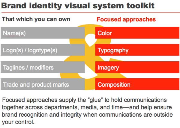
First off, there's not much in the toolkit that your company can actually "own" beyond your logo and the words and visual iteration of your tagline and product marks.
Beyond that, you communicate using largely an "open source" system, available to all. (Of course, you can own imagery you commission, and some companies, such as Mobil, commissioned proprietary typefaces.)
That you have the same choices as your competitor does not mean, however, that your visual expression need be undifferentiated or bland. The choices you make—and what results from their combination—can help you to both promote a distinctive brand image and build coherency across media, continents, and time.
In more detail...
Logo/logotype: Your primary identifier is often the most visible part of your brand system. And although it itself is not your brand, thoughtfully conceived and consistently implemented it will be shorthand for what you stand for, your promises, and what people can (and do) expect from you.
To protect your legal ownership of your mark—and the softer ownership of the meaning it has—you should have tight guidelines around your identifier's use while also making it available to fans.
Color: In the shipping business, UPS can't own brown, but it essentially does; FedEx can't own orange and purple, but it comes close.
Corporate colors have always been strong signals. But when every bank in town "owns" red, and every "green" company purports to own green, color use needs to become more nuanced.
Craft a palette that will help you talk to your different constituents in tones right for them: colors that will let you turn up, or down, the volume in a communication; colors that will increase the emotional or rational components of discourse.
And vigorously promulgate your main colors—in print, Web, tradeshows, social media—so you can come close to owning what you really can't.
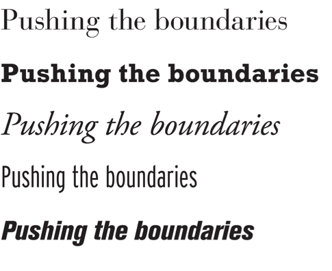
Type: All words are not created equal, nor do they have the same impact in every typeface. Choose brand typefaces that "live" the positioning and personality attributes you want associated with your enterprise. You don't have to be a professional typographer to see that a type choice can either reinforce, or work against, meaning:
Imagery: Ideally, your brand system will have a long life, so one set of images, unlike one set of colors or typefaces, won't be sufficient. But you can evolve an attitude toward imagery: Is it editorial and literal? Evocative and metaphoric? Rendered in photography or illustration? Can a customer see herself "in" the image?
Article Series:
Branding in the Age of Social
Your customers—your communities—have new expectations. They want to (actually!) interact with your organization. They want to know what they want to know—when they want to know it. And, as always, they want to know, and feel, how your organization and its brand align with their personal brands and values.
Achieving that alignment has always been critical to effective brand-building. But it's not enough to design a new logo, snappy tagline, brochures, and website (it never was).
Brand-building in this social age—social branding—goes beyond social, or even digital, media. It's about deliberately aligning your and your constituents' expectations and values, not just in communications but at the core of how your organization sees and organizes itself, how it behaves, and how it delivers on its core purpose.
In this article series, we'll outline the seven pieces of the social branding process and how each step can work hard to maximize the connections between not only you and your customers but also the connections between your customers and their trusted friends and peers (in other words, to maximize "social capital").
The series culminates with an online seminar in April, "7 Steps to Take Your Brand Social... and Still Be in Control," where you'll learn how to evaluate and develop your strategy for building your social brand.
—Tamsen
McMahon
Director of Strategic Initiatives
Sametz Blackstone Associates
Coming up with directions for imagery will give you the flexibility to mount different campaigns while still maintaining a consistent brand image.
Composition: Unlike the days when your visual system had to support only advertising, tradeshows, business papers, and maybe packaging, today you have to design for many more channels.
What's effective for a brochure won't (and shouldn't) work for a Web page. And you have limited options when presenting your brand visually on Facebook or LinkedIn.
So, again, coming up with an approach toward composition—an attitude, not a set of rules—will give you and others consistent direction. Are you trying to be asymmetric and dynamic? Conservative and steady? Multilayered or very straightforward?
Evolving Your Visual Brand Toolkit
All your visual choices need to grow out of what you've learned—and decided—about what your brand needs to project.
In earlier articles on research, constituents, brand foundation, and message development, we've outlined ways to gain understanding and then use that understanding to shape a distinctive, appropriate brand.
Evolving approaches to color, type, imagery, and composition should never devolve to "I like (or don't like) teal." Save that discussion for when you're painting your dining room walls.
Rather, make choices that helps your constituencies see you as you wish to be seen, gives staff the tools they need to effectively communicate their initiatives, and provides those outside the walls who will blog and tweet—pro and con—with a set of durable visual cues that will help you keep control of your brand mosaic.