Infographics, an effective form of content marketing, are everywhere on the Web, but it isn't always easy to come up with good designs when you want to create one yourself, especially if you're not skilled in design and visual content.
Fortunately, you have plenty of options. Many blogs and other publications offer tips and tricks to help improve your visual content, and sites like online infographic maker Visme (which I founded) and applications such as PowerPoint offer templates to help you get started.
Templates help you get a general feel about what works for an infographic and what doesn't, which can then allow you to branch out with your own designs. Often, though, in the business world, a lot of templates are simply tweaked to create an infographic; the basic template remains intact. After all, if it isn't broke, why fix it?
So here are five of the most popular templates, the reasons they work so well, and a few tips and tricks to help you make them your own.
1. Charts
Source: WordStream
Probably most people don't think of a simple chart as an infographic, though technically it could be. Instead, a grouping of charts is used to represent and highlight information in the form of an infographic. When charts are used, they're often combined with additional images and information.
The use of charts in an infographic makes perfect sense; they were some of the first ways to visually present statistical data, and they are still used for that purpose. Displaying charts together in a visually appealing way and adding a little flare goes a long way toward really capitalizing on the infographic format.
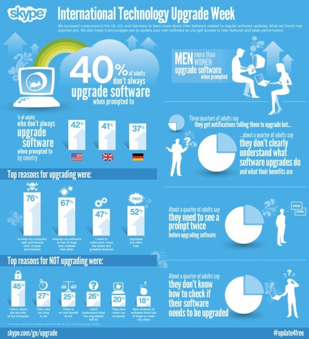
Dan Shewan lists several examples in his WordStream post, but one of the more interesting is Skype's "International Technology Upgrade Week." The infographic combines several bar charts on one side (showing reasons to upgrade verses not upgrading), and several pie charts along the other with some additional information. The charts are organized neatly and combined with Skype's appealing color combination.
Creating an infographic with charts is relatively simple: Focus on the statistics relevant to you, then create and organize those charts in a neat, appealing way.
Tips:
- When using only one chart, add extra details and effects, such as images alongside the chart, or make the visual look three dimensional.
- Find an appealing color scheme, and color-code elements.
- Include a few snippets of additional information and visuals alongside the charts.
- Add a decorative border.
2. The Map

Source: Webdesigner Depot
Maps are an effective way to showcase visual information, and they are frequently used as the basis of infographics. Those maps may be of a single country or continent or region, or the entire world, and they often showcase statistics for specific areas on the map. For example, a map may show which areas of the United States have the highest concentration of homeless people.
Maps do exactly what infographics are meant to do: They show the information rather then tell it, helping to drive the point home. Some might have different areas highlighted according to the different statistics, further aiding the transmission of a message. Moreover, they tend to be more interesting to look at than the average chart.
Some good examples of infographic maps can be found in this post at Webdesigner Depot. Take the "Healthcare Costs by State" infographic, for example; the map includes bubbles pointing to each state with the individual cost of healthcare. The map adds information about healthcare services at the top, as well as a legend for who in the US Congress supports healthcare and who doesn't.
Effectiveness aside, maps, much like charts, are also relatively easy to create. The basic template is to find or create a map based on the area you're focusing on, then add a legend, and, much like the map above, some basic information at the side or top to give background or additional information.
Tips:
- Don't use just a map; combine it with statistics and other images. (Several infographic templates found here, at Creative Beacon do just that.) Using more images helps give the map flair and allows you to display more information more easily.
- Make the map interactive. Being able to click on different areas and learn more can both make the infographic more engaging and help keep the map from being too cluttered.
- Tailor the map's style and color scheme to something emblematic of your content, rather than something more generic. (For example, using a pixel-based design if the infographic is about videogaming.)
3. Flowcharts
Source: Murera
Flowcharts typically show progression from one thing to the next, and they can be a great way to present information about processes or timelines. Naturally, flowchart infographics are popular, as they can combine text and image elements relatively easily.
What really aids a flowchart infographic is the natural, well, flow, allowing you to lead viewers clearly from one topic or point to the next. Moreover, it can readily show growth and transitions based on choices, perfectly illustrating, for example, how companies and movements have changed based on different courses of action.
Timelines are a related example, obviously focusing more on the time aspect than a cause-and-effect transition. They can show how something, such as a relationship, has progressed over the years, providing information about various important dates. Henri Wijaya lists several examples of timelines at Bashooka—for example, a road map template and a straight line with dots that's a bit more typical.
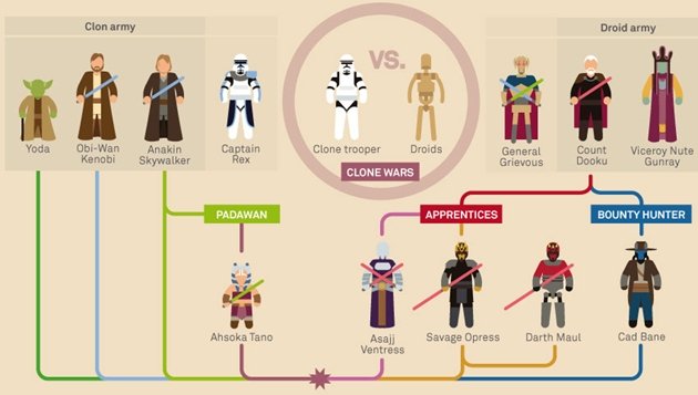
Fans of Star Wars would appreciate these flowchart infographics at Murera. Each shows the characters for the different facets of the Star Wars universe and then shows how they connect to each other, simplifying the character relations into a format quickly understood at a glance.
Creating a flowchart or a timeline generally starts with a source—a specific date, in the case of a timeline, and usually a person or concept for a flowchart. From there you can place key information at various points along linear progressions and interconnected pathways.
Tips:
- Create a type of pathway appropriate to your topic—roads, space travel, arrows, a board game, or any other creative idea you can think of.
- Much as you might with maps, make them interactive; allow viewers to see what choices led to what outcomes by clicking on them.
- Try adding animated elements to draw attention.
4. Resumes
Source: iDesignow
A bit different from the other templates on this list, infographic resumes have been gaining steam. They can help you stand out in a crowd and make your resume more memorable, allowing you to both add more information in a condensed manner and show off your creativity. They can help show off your personality better than the average resume when you add elements of personal flair.
Tonya Wells lists creative examples in Infographic World. Roberto Rocco's, for instnace (listed under "Fancy Creative"), combines stylized and normal fonts as well as an engaging color scheme and some artistic elements—such as his photo "taped" to the top"—to create an appealing resume that highlights his personality and capabilities.
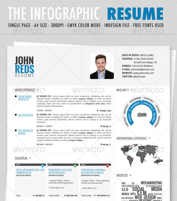
iDesignow has a relatively useful infographic resume template. The template includes a photo, name, and contact information at the top, then compiles charts and lists in various sections. Filling in the blanks here is a good way to practice, but you can also play around with formatting to decide what style works best for you.
Tips:
- Add elements that represent you, as a person, to gain further attention. If you're artistic and going for a graphic design job, add artistic elements; the more logical and business-like would stick to something more straightforward. Let your personality come through.
- Use charts in creative ways; for example, one of the templates I referred to earlier uses a sort of chart to illustrate key points of the person's personality.
- Although these infographics are fun, they're still for a professional audience. Find that balance between expression and professionalism to really make this format shine.
5. Comparisons
Source: Pardot
Creating comparisons between two disparate objects or sides or issues is relatively easy in an infographic format, so it's hardly surprising that so many people use such templates.
What makes this format so successful is how quickly it can compare and contrast opposing sides. Using similar images with minor differences for each subject exemplifies both similarities and differences in one go. Moreover, a visual platform naturally lends itself to more engaging compare-contrast formats, as images can aid text in driving the point home.
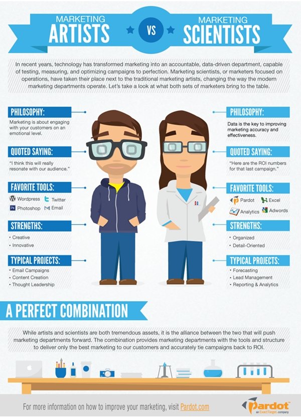
A good example by Matt Wesson is "Marketing Artists vs. Marketing Scientists" from Pardot. The infographic uses two cartoony people drawn in the same style, and then proceeds to list the differences between them in various areas, such as philosophy. A section below the two images explains that the two work best in tandem.
Creating a comparison infographic involves doing something as simple as splitting the page in half, placing two similar images representing your subject in each side, and then organizing a few simple blocks of text about each alongside the images. However, they can easily be taken further and expanded on.
Tips:
- Instead of using two images, split one in half, or combine the images so that they look like two different halves of the same thing.
- Use text blocks in ways that draw attention to your subject. For example, use circles with lines back to the original comparison images.
* * *
Many templates exist to help you create your infographics. Give these five a try to see what works best for you; once you've started to get an understanding of how these work, branch out and make your own—or improve on these designs in whatever way you find best.