Email marketing delivers clickthrough rates that are up to six times higher than that of social and generates the highest ROI of any marketing channel.
But an email is only as good as the content it contains.
Users spend just 11.1 seconds reading an email, on average; images, therefore, play a vital role in grabbing attention and communicating the right message. As the age-old adage goes, a picture is worth a thousand words.
But how do you choose the right image? How can you be confident that it will generate results? What are some real-life examples of effective and informed image selection?
The Importance of Images
Pictures are a universally understood language. They draw our eyes before anything else, and they can increase the inclination to read a piece by 80%. Customers themselves say they prefer and focus on images over text.
Images also help us remember information. After three days, people are likely to retain just 10% of the information they have consumed; but when the information is combined with a relevant image, they remember six times more, according to a study by John Medina.
Selecting the Right Image
With an abundance of images available to marketers today, it can be difficult to know where to start. How bright should it be? Should it have a particular hue? What themes or activities should it depict? Should it have people in it? If so, how many?
To start answering such questions, we need to understand what makes an image more or less appealing and under what conditions. Of course, A/B and multivariate tests can play an important role, but they tell us only that a particular image works better than another—not why they do. Knowing that is essential for taking lessons learned into the future and for adopting a data-driven approach to marketing.
Enter the science of image appeal and memorability.
Subject
A study conducted by researchers at MIT found that images with people in them are the most memorable, followed by "human-scale space" (e.g., the produce aisle of a supermarket), and closeups of objects. The least memorable images were natural landscapes, unless they featured an unexpected element (e.g., shrubbery trimmed into an unusual shape).

In 2015, some of the same researchers released MemNet—a deep-learning algorithm that allows anyone to upload a photo and get a memorability rating for it (try it out here).
Color
Colors communicate messages, evoke emotions, and influence behavior. In fact, up to 90% of snap judgments about products are based on color alone. Although there is little evidence of specific colors performing universally better than others, research has found that there are gender differences in color preferences, with men preferring bolder colors and women preferring softer colors. Other studies have found that relaxing colors, such as blue, can make website actions (such as file downloads) appear more rapid and produce stronger buying intentions.
However, decisions over which colors to use come down mainly to what you want to achieve (you can see which emotions are commonly associated with various colors in the box, below). The most important thing is that a color is perceived as being appropriate for your brand and product.
As a result of evolution and culture, humans have developed certain associations with colors:
- White: purity, cleanness, simplicity, hygiene, clarity, peace
- Yellow: cheerful, optimism, extraversion, friendliness
- Pink: sincerity, nurturing, warm, soft
- Red: excitement, arousing, exciting, stimulating
- Orange: arousing and exciting, lively, energetic, extroverted, sociable
- Blue: competence, intelligence, communication, trust, efficiency, duty, logic
- Brown: seriousness, reliability, support
- Back: sophistication and glamour, power, stateliness, dignity
- Purple: luxury, authenticity, quality
- Green: nature, security
Source: Exciting Red and Competent Blue: the Importance of Color in Marketing (Labrecque & Milne, 2011)
Filters
A study from 2015 found that using an image filter on Flickr and Instagram increased the chance of a photo's being viewed by 21%, and the number of comments it received by 45%. The reason? The increased contrast and exposure, which can bring out colors or highlight specific objects. But not all filters are equal. Filters with a warm temperature had a greater impact on engagement, while "aging" filters decreased engagement.
However, selecting and optimizing images to be both technically good and aesthetically pleasing as possible to the typical user might not be something marketers have to do manually for much longer. Using human-rated photos as the training dataset, Google has built a model that can rate any photo it is given against those two factors.
The Role of Personality
Insights into those three areas (subject, color, filter) can provide valuable guidelines for selecting images to use in your next campaign. But what accounts for the individual differences in the appeal of different images?
In short: personality.
Our personalities underpin how we think, feel, and act—including how we respond to different images.
The Big Five is the " most widely used and extensively researched model of personality" today, and it is supported by a wealth of independent, peer-reviewed research. The model has been found to be applicable across languages and cultures and it has even been found to have genetic and biological bases.
As the name suggests, the model has five dimensions of personality: Open-mindedness, Conscientiousness, Extraversion, Agreeable, Neuroticism. Each of them refers to a continuum of personality traits (e.g., Conscientiousness ranges from spontaneous and easy-going to organized and efficient).
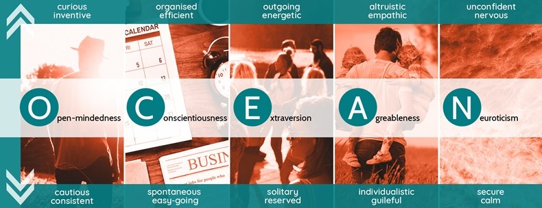
The Big Five Personality Model
By tailoring content, such as images, to the personality of the recipient, it is possible to increase engagement significantly.
A landmark 2017study—which involved delivering Facebook ads to 3.5 million people—found that ads tailored to the individual's personality resulted in up to 40% more clicks and 50% more purchases.
Those findings are backed up by our work at DataSine. For example in 2018 we worked with a leading Russian bank to help them understand the personality of their customers and personalize their email marketing accordingly. Changing only the header image of the email—matching it to the personality of the recipient—we were able to increase clickthrough rates by 44%.
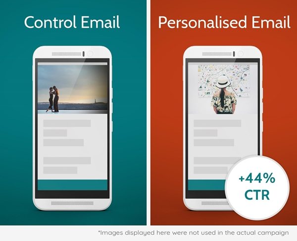
The new image was selected using our platform; the personalization models that underpin it take into account a vast range of factors, including image hue, number of people featured, and activities depicted.
A Considered Approach
A single image can have a significant impact on the performance of an email campaign and the extent to which customers receive an experience that is compelling and personal.
Selecting the image that has maximum appeal requires considering a range of factors, including the subject, hue, and filters used in your image; the message you want to communicate; and the personality of your customers.
Fortunately, technological advances and increases in the availability of data have meant that we are now seeing digital tools arrive on the market that can provide insights into image appeal before they are ever distributed in an email campaign.