Landing pages have become a digital marketing staple. Marketers now spend countless hours planning, building, and testing a range of landing pages. Despite their popularity and the amount of resources invested in them, however, landing pages don't always perform as marketers expect them to.
If you're going to smash your landing page conversion goals, you've got to do everything right—technical implementation, promotion, design...
This article will help with the inspiration and advice you need to make your next landing page incredible. In it, we'll look at
- The most important elements of landing page design
- Ten of the best landing page examples
- Five landing page design best-practices to apply immediately
Let's start.
Five Most Important Elements of Landing Page Design
Before we look at some examples for landing page inspiration, let's go through a checklist of five design elements you simply must include to succeed.
1. Consistent Branding
Landing pages are an extension of your brand and so need to reflect its unique personality. That means that they should follow your brand and style guidelines to the letter.
In the landing page examples we're about to consider, you'll be able to identify the business they belong to in a split second. When you create your own landing pages, that's what you need to strive for.
Especially when marketers have to manage a lot of tasks, far too many of them have a tendency to spin up landing pages in a few minutes and neglect their brand guidelines. Doing so can create inconsistency, leaving your visitors confused and decimating your results.
2. Enticing Visuals
The vast majority of communication to the brain is visual. Within a millisecond, your visitors will process the visuals of your landing page and start to make unconscious assumptions. Knowing that, you can use how prospects perceive your website to your advantage.
When we look at some example landing pages in the next section, try to identify what those pages make you feel based on your first impression, and try to understand how visuals played a part in that.
Don't fall into the trap of grabbing a slick royalty-free image and thinking that will do for a landing page. Take the time to find visuals that will leave the right impression on your visitors. Even A/B-test a few options.
3. A Clear CTA
Your landing page exists to do one thing above all else: convert your visitors and generate more leads. That's why it's so important that your call to action be clear and impactful.
Again, check out the CTAs used by some of the best in the business when we look at landing page examples. Think about the language that's used, the examples that resonate with you, and why they do.
Your CTA could make or break your landing page, so make it count.
It's also common knowledge that every time a marketer writes "Click Here" for a CTA, an adorable puppy gets sad for a little while.
4. A Robust Form
Forms might seem simple, but there's a lot to think about when building your own. You'll need to make important decisions, such as which fields to include, where to put your form, whether to include mandatory fields, and more.
There's a lack of consensus on building forms, considering that your needs will vary according to various factors. Again, pay attention to the forms used on the example landing pages later in this article.
If you give your forms the love and attention they deserve, you'll be able to avoid frustrating your visitors. There's nothing worse than creating a landing page and driving traffic to it, only to be let down at the finish line by a faulty form.
5. Social Proof
Social proof sections have become a staple on landing pages, and for good reason: testimonials can significantly increase conversions on landing pages. This is such an expected convention, in fact, that your visitors will notice if it's missing.
You can incorporate social proof into your landing page in various ways. The tactic that's best for you will vary. We'll see some great examples in the next section.
If marketers fail to include a social proof section on their landing page, there's a good chance they'll see their conversion rates suffer.
10 Landing Page Design Examples From Popular Tech Companies
Before you start putting together your next amazing landing page, it's worth looking into some good examples. Here are 10 of our favorite landing pages.
1. Slick Like Slack
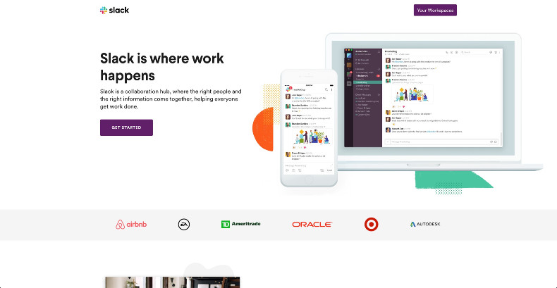
Slack is a team communication tool that has an incredible user base of around 12 million active daily users. It's also the proud owner of one of the coolest landing pages on the Web.
Here's what this page does best:
- Attractive and descriptive product screenshots
- A clear CTA placed above the fold
- Bright, enticing, and consistent branding
- Social proof that's placed high up the page
2. Keep Things Uber Simple
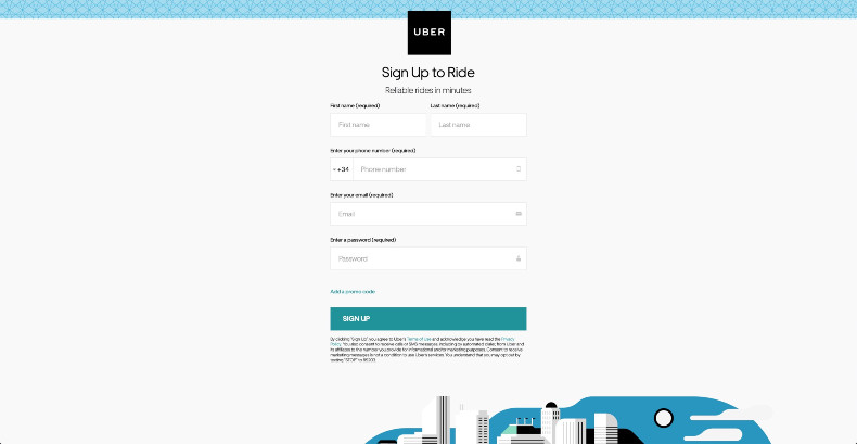
Uber's user base has grown to include over 110 million worldwide users, and it's a big player in the sharing economy. A lot of Uber's impressive growth has been driven by great Uber landing pages like this one.
Here's what we like the most:
- Super clean
- Passes the "blink test"—users are oriented right away
- A clear form that's a delight to use
3. Inspiration From Intercom
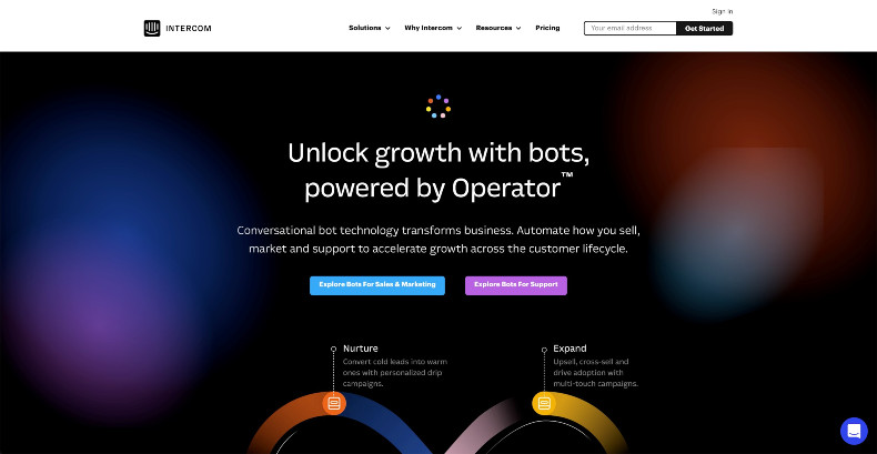
Intercom offers transformative conversational bot technology. This silky smooth landing page would give Apple's beautiful product pages a run for their money.
Here are the highlights:
- Breathtaking CSS animations that drive value
- A highly attractive and consistent design
- Seven precise benefits outlined using just a sentence each
4. Lyft Your Lead Gen Results
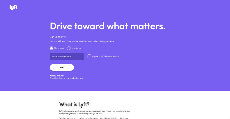
We've already looked at Uber, but check out this landing page from its competitor Lyft. This is a clean landing page that Lyft uses to entice Uber drivers to sign up with Lyft.
Here's what we like about this page:
- Very consistent with Lyft branding
- A direct and fast sign-up form found above the fold
- A comprehensive FAQ section
5. Learn From Khan Academy
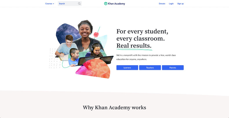
Khan Academy is a nonprofit that's on an inspiring mission to provide world-class education for everyone around the world. We can also learn a thing or two from this Khan Academy landing page.
Here's what we love:
- Excellent imagery that engages the visitor
- Great graphics and sketches that champion the brand
- Nice social proof and testimonials throughout
6. Code Like Codecademy
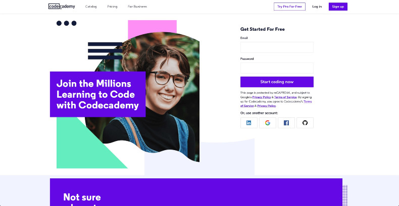
Codecademy is a platform that aims to inspire students around the world to develop their coding abilities. This informative landing page offers a great overview of their offering, and there's a lot to draw inspiration from.
Here's why we like this page:
- Social proof, CTA, and form all above the fold
- Log in options make it simple to get started
- Engaging images and graphics
7. Microsoft Showcases Its Lead Gen Talents
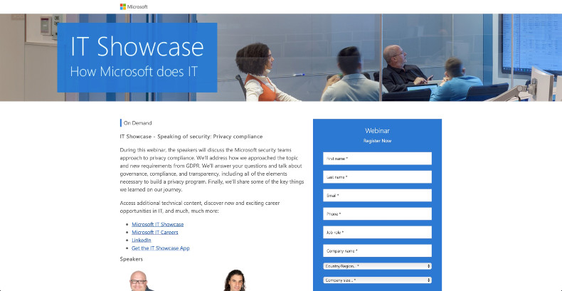
This webinar landing page from Microsoft was created to attract webinar attendees who are curious about how Microsoft security teams approach privacy compliance.
We think this landing page does a few great things:
- A simple layout that passes the blink test
- Clear CTAs
- A robust form that's simple to fill out
8. Generate Demand Like SquareSpace
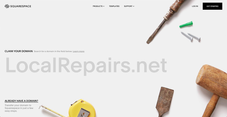
SquareSpace is a big player in the WYSIWYG website builder space, and landing pages like this have played a big role in that dominance. This landing page is super informative while oozing cool.
Here's what this landing page does best:
- Beautiful interactive content above the fold
- Impressive technical and graphic design choices
- Clear and precise copy
9. Sage Inspiration From Wise (Formerly TransferWise)
![]()
TransferWise is transforming the way people around the world send money across international boundaries. This landing page from Wise does a good job of explaining the process and even offering a calculator tool to entice visitors.
Here are the highlights:
- Intelligent use of graphics and interactive content
- A clear value proposition
- Great illustrations and CSS animations
10. Airbnb Has the Key to Success
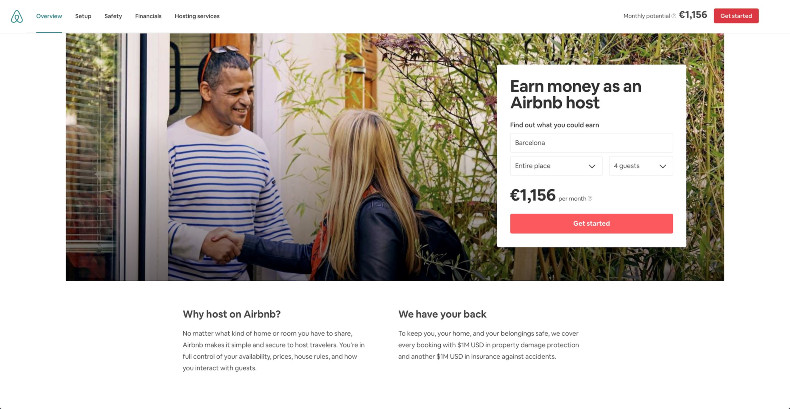
Airbnb has cemented its role as a protagonist in the dramatic transition to the sharing economy. Many of Airbnb's 650,000 worldwide hosts will have started their journey on a landing page like this.
Here's what we really like about Airbnb's landing page:
- An interactive calculator that doubles up as a form
- An engaging hero image
- Lots of social proof
Five Landing Page Design Best-Practices to Apply Today
There are some pretty incredible landing page examples out there, right? We've seen some of the best, but what does it all mean? What should you be doing to replicate their success?
Here are five best-practices you should apply to your next landing page.
1. Implement interactive content
Interactive content is an effective way to engage your visitors and educate them about your product or service. In fact, 93% of marketers agree that interactive content is effective in educating buyers.
Airbnb and TransferWise offer up good examples of interactive content in action. Their two above-the-fold tools can immediately pull visitors in and help them to see what they stand to benefit.
There are tools that can help marketers create interactive content. Calculators, quizzes, and interactive videos are emerging as some of the most effective types. With all the available possibilities, it can be hard to decide. Still, you have to prioritize and use the content mix that suits your audience best.
2. You can't neglect copy
Landing pages often look beautiful, and we've written here about how much more impactful images can be compared to text. But your copy is still critical.
Your visuals do the job of engaging and enticing your visitors, but those visitors will eventually want to read and learn more about your product or service. That's why you should engage your copywriters to create highly effective text.
Your copy should be incisive and easy to read: Every element of your landing page should push your visitor to convert.
3. Your form must work well
Landing page abandonment can be frustrating, and there are a few key reasons for it. One of the main culprits, though, is a poor-quality form.
Test comprehensively to make sure that your form isn't blighted by these issues:
- Overcomplicated fields
- A lack of guidance for mistakes
- A lack of logical sequencing
- Disappearing labels
Those are just some of the key issues that can frustrate your visitor and cause them to find an alternative. Use collaboration tools to work together on landing pages to resolve these types of issues before publishing.
4. Engage your visitors above the fold
As marketers, we probably know better than anyone else just how quickly the average user zips across the Web. You've got mere seconds to capture their attention and share your message—which is why you should engage your visitors right away.
To engage, you need to focus on your above-the-fold content. You'll undoubtedly have noticed how in the examples above the forms and interactive content are above the fold.
5. Use the right tools
There are high-quality landing page tools and web design software out there. Those tools offer features like WYSIWYG editing, templates, and more.
It's important that you make the right choice, though: There are slight differences among those landing page creation tools, and they could affect your ability to create a high-performing landing page. Do your research and you'll give yourself the best chance of success.
Also think about how your tech stack can affect your landing pages. Find the best proofing tools, for instance, and you'll boost your results.
Closing Thought
Obviously, there's a lot to think about when designing landing pages, but it's worth the time and effort when you consider the impact those details can have on conversion rates.