In days one through four of our crash course on conversion, we covered the economics of conversion, why homepages aren’t the best way to get results, and how to effectively use landing pages and calls to action to boost conversion. Our final installment covers page optimization and testing.
Day 5: Optimization and Testing—Every Page Can Convert Better
Once you start walking down Conversion Avenue, you'll probably find that it's a one way street—there's no turning around, and the traffic flows much better in a single direction.
Optimizing your landing pages can become an addictive pursuit of the perfectly converting page. Like unicorns and fairies, such a page doesn't actually exist; and though there is no magical pixie dust to sprinkle over your website, there are processes and techniques you can use to make the most of your conversion opportunities.
The best part? No matter what your page is for, it can always convert better.
The most obvious business reason to start a testing and optimization process is the economics: Do it right, and you'll get a higher return on your marketing spend. A no-brainer.
Here are two other reasons for testing:
- You can solve boardroom arguments. We've all been there—sitting around the boardroom table discussing a page on the website, or if you're advanced, a landing page. Opinion goes back and forth about the main headline, what color the button should be, or, horror of all design horrors, the dreaded request to make the logo bigger.
It's time to realize that internal democracy, experience, and the HIPPO's (Highest Paid Person's Opinion) really don't matter. Having a disagreement about a concept? Then test it.
- The customer is still always right. If you are serious about conversion optimization, lesson No. 1 is to listen to your users. It's a beautiful thing to turn the power over to your user base for conflict resolution. Say no to archaic subjective opinion! Say yes to learning something about your customers!
It's true that you still need the expertise of your team to create a new version of the page to test; instead of debating who's right ahead of time, however, run an experiment and discuss the results. You'll learn which message or design works best for the people who truly pay your salary.
Got an Idea? Test It, Start an Experiment
The foundation of conversion rate optimization is what's called an "experiment": You create competing page variants and simultaneously run traffic to each page to see which has the highest conversion rate.
Note that you need to run enough traffic through the experiment and leave it running long enough to obtain statistically viable data (testing tools call this the confidence level). By allowing the test to run for at least a few weeks, you can remove daily variance from the statistics (perhaps people react differently to your weekend-Vegas-vacation ad during the week, compared with a Saturday).
There are two primary testing methodologies:
- A/B testing. As the name implies, you're comparing two pages, A and B (although you can include as many pages in the experiment as desired—A/B/C/D/E, etc.). The best performer is declared the winner or "champion," and becomes the sole recipient of all traffic. In the following example, the position of a signup form is being tested with page B emerging as the winner. Usually, you'd use A/B testing to test a single idea, wait for results, and choose the victor. That can be a slow process, but it's very effective at optimizing individual areas of your page. (Testing can be frustrating, but it is always fun—and almost always surprising.)
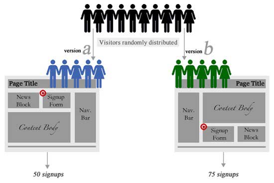
(source: https://media.smashingmagazine.com/cdn_smash/wp-content/uploads/2010/06/abtesting.gif)
- Multivariate testing (MVT). Multivariate testing is a more advanced method; multiple versions of your page are generated to facilitate comparison of most every possible combination of page variant. For instance, if you want to test two variations of the page title, call-to-action position, and form length, your test would produce 8 (23) or more variations depending on the specific method of MVT model being used. The impact of this approach is that you need a long time and large traffic volume to achieve valid test results. Accordingly, it's used for pages receiving thousands of visitors.
Optimization is the process of repeating test experiments to improve their effectiveness.
What Should You Test?
What you should test—a common question—ultimately depends on the content and purpose of your page. Here are some basic elements that most people can test as a starting point:
- Page headline or title. This is where you state the unique selling proposition (USP) of your product/service/offer. It's the page element most open to interpretation by your visitors, as it's usually what they see or read first. Therefore, it has a great impact on conversion. Remember, though, that it also has a big impact on your message match. So keep it tightly aligned with your ad copy.
- With or without video. Video has been shown to increase conversion rates as much as 80% (source: eyeviewdigital.com, pdf). A classic A/B test is to add video to your page showing a demo or a face-to-face personalized message.
- Video auto-play on or off. Usability pros will know that turning on the auto-play feature is a bad practice that often makes people back out of a page, especially if they are in an environment sensitive to sound. However, this is where CCD (conversion-centered design) differs from UCD (user-centered design). You need to weigh the cost/benefit of any increased conversions against a potential negative brand impact.
- Call-to-action attributes. Another classic test is to play with the size, position, shape, color, and text of your CTA buttons. Different colors have different emotional meanings and can sometimes have an impact, although a more important aspect is the contrast between the color of the CTA and the rest of the page (make sure it stands out). Remember to make the text represent the outcome (what happens when you click, as we defined on day two).
- Number of form fields in a lead-capture form. Increase conversions by lowering the barrier to entry with fewer form fields.
- Required or nonrequired fields. Experiment with making different fields not required.
- Length of copy. Some products or services demand a long and exhaustive description—but, generally, short and succinct is better. The only way to know for your own business is to try it. When refining your message for the short version, simplify your copy using bullets and take the advice of usability guru Steve Krug for the main bulk of content: "Cut it in half, then throw away 50% of what's left."
Day 5 Resources
- A/B testing on Wikipedia
- Multivariate testing on Wikipedia
- Testing tools: Google Website Optimizer, Unbounce, Visual Website Optimizer, Performable, Optimizely.
Day 5 Task
Getting started. When deciding on what to test in your first (or any) experiment, it helps to have a checklist of common problems to rate your page in its current state. The five-minute conversion scorecard can help you identify any major holes in your page. Pick a page on your site (ideally a standalone landing page, but you can try it on any page as an exercise) and see what score you get. Any items left unchecked can be used as a to-do list for your first experiment.
MarketingProfs Resources
- Website Conversion Success Stories—11 case studies (publication)
- Take 10: Crank Up Conversions With Your Facebook Welcome Tab ( online seminar)
- Advanced SEO Strategies for Higher Rankings and Conversions (online seminar)
- The Seven Deadly Sins of Landing Page Design (online seminar)
- Sure-Fire Tips for Increasing Your Web Conversions (online seminar)
- Demolish the Roadblocks on Your Website: Clearing a Path for Customer Action, Sales and Loyalty (online seminar)
- High-Performance Landing Pages that Boost Your Bottom Line (FREE) (online seminar)
One Final Task...
Bookmark this page!


