Last month I received an email from my grandmother that included the telltale "sent from my iPad" signature at the bottom. It is safe to assume that grandma does not know what an app is, and that she uses her iPad for Skype and email only. Yet, it made me realize how mainstream mobile technology has become.
Which leads to the question: With nearly half of emails now opened on mobile devices, are companies designing emails with a mobile mindset?
Most companies have only a basic mobile optimization strategy, if any at all, so here are five tips for taking your email to the small screen.
1. Get to the point
The number of characters displayed in the subject line will vary depending on the device's operating systems and orientation, from a minimalist 24 character in a portrait orientation for some Android devices, to a generous 61 character in a landscape orientation for certain windows smartphones.
Consider that one-third of email recipients open email based on the subject line alone. If your subject line "Spring is finally here: 50% off all dresses" is cut off after 24 characters, your subscriber will see "Spring is finally here:" instead of the discount. A better option is moving the core-messaging element to the very start of the subject line to accommodate for the device display: "50% off dresses: spring is finally here!"
Overall, the message is the same, only this time the key message gets through to the audience.
2. Design for finger-pointing
A few holdouts notwithstanding, most actions on mobile are now performed via finger-tapping. Accordingly, clickable elements need to be designed for fingers, not a mouse. Though the click of a mouse allows for a great deal of precision, a finger doesn't: the average adult finger pad is 10-14 mm, which roughly translates to 37-53 pixels.
When designing calls to actions, allow sufficient width for tapping (in the 40s range), but also enough padding space between two buttons or links. Indeed, two CTAs that are too close together can result in the user's inadvertently tapping the wrong link, which would lead to a lower conversion rate for your mobile email.
The following is a good example from Target. Several calls to action are on the same line, but notice how the buttons are around 50px, more than enough room to fit a finger pad, and the design leaves 5px between buttons. Though the space between buttons is a little tight, because the buttons are so large, tap error is minimized.
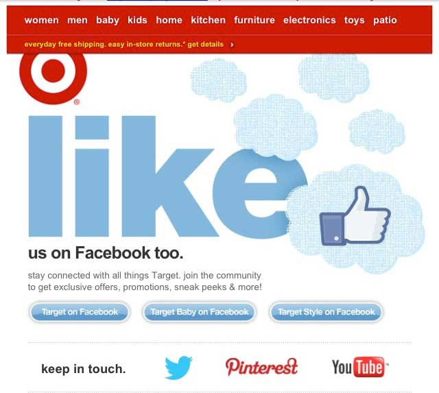
February 20, 2013—Target email
3. And consider the nearsighted...
Remember the part about small screens? Ensure you use fonts that don't require users to press their nose to the screen to read. Use 14-point font types for body (NB: Apple automatically resizes fonts to a minimum 13 points) and 20-point type for headings.
4. Simple is better
Screen resolutions are far from standardized in the smartphone world. That great desktop design might end up requiring a considerable amount of scrolling in some mobile devices.
One solution is to stick to a scalable single-column layout. A single column works well on your desktop version, and it works well in your mobile version. Meanwhile, elements such as fonts or buttons should be automatically resized to render better on mobile screens without requiring pinch and zoom.
The other option is to use responsive design, the advantage of which is that it will adapt the design to the device, providing the best user experience possible. The disadvantage is that it doesn't work across all devices.
Here is an example of a responsive design on three devices—iPad 2, iPod Touch, and Samsung Galaxy S3, respectively:


So how do you choose which way to go? Test, test, test... and know your customers. Since open rates might be skewed in favor of Apple (see the next tip, No. 5), it might be best to rely on unsubscribe and visit rates to gauge the success of a design vs. another. Or try to survey your customers to see whether they are more apt to use Apple or Android, and if the latter, which kind, so that you can design more accurately.
5. Think outside the Apple
Roughly 40% of smartphones in the US run on Apple iOS, compared with more than 50% running on Android OS. However, according to most research, the vast majority of emails opened in mobile devices are opened on an IOS device. Consider, though, that Android devices typically block images by default, unlike IOS. Accordingly, open rates are likely highly skewed in favor of Apple.
Moreover, that image-blocking makes the case against using single-image designs: If your subscriber is using an Android device, that email will be blank. According to January 2012 research by e-Dialog, 63% of mobile subscribers close or immediately delete emails not optimized for mobile. A blank screen would fall into that category.
To avoid having your emails ignored or sent to the trash by Android users, instead of using one sole image as an email, break it down into both text and images for which alternative (alt) text can be used in a stylized way to entice image download.
For Android, as with the scalable/responsive design, keep testing—and use a metric other than open rate to gauge success, especially when A/B testing.
* * *
Mobile is just another exciting channel to test when designing emails (a channel that could overtake desktop by the end of this year for email opens). The main thing to remember is that you are designing for a small tactile screen, and adapt your emails accordingly.


