The success or failure of a digital marketing dashboard is closely linked to data visualization: Focus on users and their tasks, and you're likely to succeed; focus purely on data visualization, and you'll fail.
That's because tailoring your dashboard to user needs transforms ideas into action, and data visualization into visual management support.
So what specific measures can you take to ensure such success?
Consider the following three questions, and then take the action steps described if the answers to them are "no."
1. Is the provided information relevant to users, and do they have the tools to influence it?
Consider your daily commute to work. If driving, you use the most popular dashboard of all—the car's dashboard. Thankfully (for purposes of this article), that dashboard is a perfect example of a badly designed one—because designers were primarily concerned with pure data visualization.
Now consider your commute home from work. You can compare that journey to reaching your organization's goals. You want to achieve your goal quickly and in a cost-effective way (effectiveness and efficiency). You are a considerate driver, you observe the rules of the road, and you try to minimize the risk of errors. To reach your goal successfully, you need data related to your goal and your driving habits.
Let's take a closer look at your car's dashboard (figure 1). From left to right there is a display for engine temperature, RPM, current speed, fuel level, and, below the tachometer, the total number of miles driven over the life of your car.
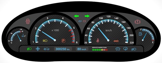
Figure 1: Dashboard of a car
But for the commute home, you really only need two out of those five figures: fuel level and speed. You probably check your fuel level before leaving. Or maybe you're a driver like me who relies on the car's early warning system, which informs you of low levels.
While driving, you mostly check your current speed and alter it as necessary to road conditions and changing speed zones as you encounter them.
It's far less likely that you will pay much attention to your ongoing mileage or RPM. Why? Because neither piece of information is relevant to the journey.
Those are examples of traditional data visualization, in which all available data is visualized even if it's not relevant to daily activity.
What remains is the engine temperature. Even though a temperature that is too high could affect your journey, you won't pay much attention to it, because you've learned two lessons over time: The display has never changed and, if the temperature is too high, a control light will warn you.
As you can see, the speed display is the only one that actually leads to action. At least two out of the other four could be eliminated.
Unfortunately, that's also the case with many digital marketing dashboards that visualize data.
So, when you set up a dashboard, think of that simple example. Avoid visualizing data just because you can. Think of users and their tasks. Make sure that the information is relevant to and has a direct impact on them: It is useful only when users have the knowledge and tools to change a given situation.
Dashboards for customer feedback management are a good example of operationalized data. Customer satisfaction is measured on a regular basis, and the insights gained are presented to managers of the organization using dashboards.
If shop cleanliness was an issue yesterday, staff can work on improving the situation today. If a client complained about a recently bought product yesterday, a staff member can solve the problem by reaching out to the client today. That kind of dashboard focuses on the tasks at hand and on improving customer satisfaction—not on simply visualizing customer satisfaction.
In contrast, dashboards with indicators for brand awareness and brand image usually provide little potential for specific action. Although that information is relevant to product managers, the dashboard will be successful only if the product manager has the tools to act on those indicators within a reasonable period of time.
In any case, dashboards should contain actionable information. Otherwise, you might as well use a presentation that depicts the data and is updated only from time to time. Why would I log onto a dashboard that shows numbers I already know because they rarely change, and numbers I can hardly influence because I don't have the tools?
2. Does your digital marketing dashboard tell a compelling story that matches your goals?
Telling a story via dashboard always starts with understanding the actual goal: what success means to the individual user, and which success factors, milestones, resources, and challenges are on the journey there.
You can then create a map that provides an overview of all necessary information. It should not only include data that is already available within an organization but also factor in previously unexploited data sources as placeholders.
A well-designed dashboard should always point to existing blind spots. And an information map should adapt to changing conditions from time to time.
Much like a map that depicts the spatial relationships between countries and cities and shows how to get from point A to B, an information map should highlight the interaction between several pieces of information.
It is all about displaying cause and effect. A compelling story develops as soon as a user explores and understands the cause for a given change. The "what" factor (what happened lately?) should, wherever necessary and reasonable, be combined with a "why" factor (why did it happen?). Only the "why" calls for actionable ideas.
The more reasons and answers a user discovers, the more practical and compelling the story becomes and the easier it will be to create an effective action plan.
Let's look at an example of simple causality: Revenue (the "what" factor) can be described by means of the following indicators (the "why" factors): Number of Visitors * Conversion Rate * Average Order Volume = Revenue.
Unfortunately, many dashboards today consist of widgets (see figure 2), which are visual containers that contain individual data or information and present those as graphs:

Figure 2: Widget dashboard
This type of dashboard makes it harder to recognize causality. What cause-effect relationships exist here? How do the individual pieces of information influence each other? From figure 2, you can't tell what causes the decrease in revenue.
Although this type of presentation conveys a sense of completeness, crucial information such as splitting revenue into offline and online revenue is missing. Furthermore, all sets of data are presented equally, although customer satisfaction and mentions in social media certainly don't have the same influence on overall revenue.
Telling a compelling story requires a different kind of dashboard, one that depicts data and information as an infographic (see figure 3). Only then can you effectively illustrate the relationship of cause and effect.
In figure 3, the user can tell at first glance that the main cause for the decrease in revenue is insufficient in-store (offline) revenue, primarily caused by a conversion rate that did not meet expectations—perhaps because of an insufficient desire to buy on the grounds of a poor product portfolio.
Apart from visualizing causalities, infographic dashboards visualize information according to their importance. Important information takes up more space than additional, supporting information. Whereas in figure 2 "online traffic by channel" seems visually equal to "revenue," in figure 3 the importance of each indicator appears in accordance with the actual influence it has.
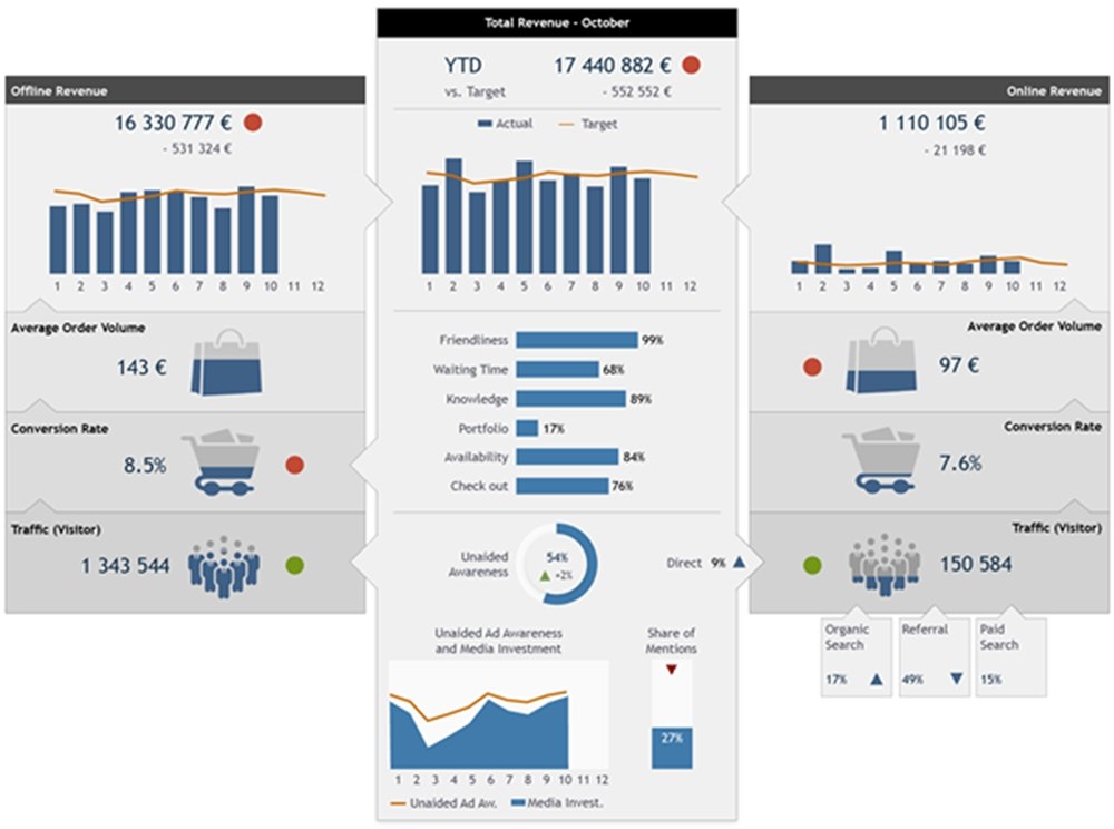
Figure 3: Infographic dashboard
Both dashboards provide almost identical information. But only the infographic dashboard (figure 3) actually supports a quick identification of cause, puts the different aspects in relation to each other, and allows for creating an effective action plan.
Widget dashboards, on the contrary, are typical data visualization tools. Users are required to identify causalities and therefore they mainly focus on the "what" part. The "why," and developing actions based on that information, is often omitted.
3. Does your dashboard provide sufficient (high-quality) context?
The final element for a successful dashboard is context.
Data alone is often not enough to be able to make an informed decision. Less-experienced users have a hard time interpreting raw data. The consequence is poor or no action. Accordingly, every dashboard should ensure that the target group can draw the right conclusions based on the information provided.
Optimize your dashboard with comments, advice, and background information; and, again, go beyond pure data visualization. Often, you can shed light on facts and figures if, for example, the user is provided information regarding the main competitor's campaigns the previous month. That necessary information might be provided by the relevant department.
Give users a comprehensive overview of the current situation, which will result in effective decision-making.
* * *
Using pure data visualization to develop your digital marketing dashboard is a faulty approach. Focus on the users of the dashboard first, rather than on the data. Determine what kind of information is really relevant and what data is actionable. Show your users the causes, and support the process of transforming information into action.
By optimizing your data with relevant, high-quality information, you will make it easier for users to interpret it and determine future measures that should be taken. In the end, that is the best test of a successful dashboard.
More Resources on Marketing Dashboard Metrics
10 of the Best Marketing Analytics Tools to Try in 2020