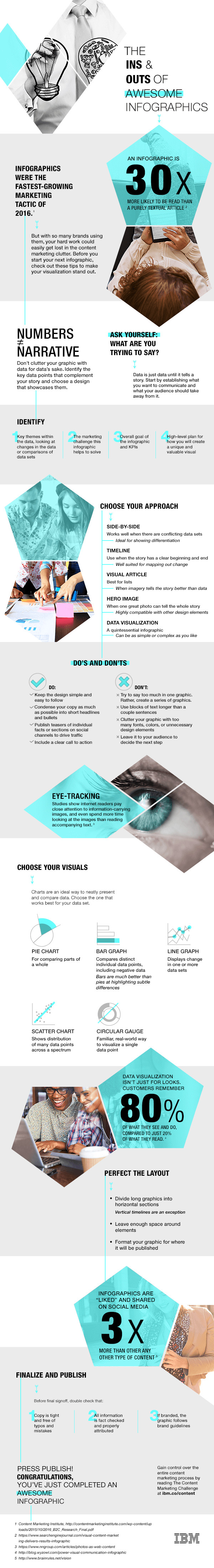
An infographic is 30 times more likely to be read than an all-text article, and infographics are liked and shared on social media three times more than other types of content, according to data cited in an infographic published by IBM via the company's THINK Marketing media site.
With those statistics in mind, marketers everywhere should be thinking about how to create more infographics—and more useful infographics—for their audiences.
What can you do to make sure your infographics are helpful, eye-catching, and effective? IBM offers some key tips:
• Choose your format. Timelines can help you tell a good story, while data visualizations can help clarify a complex story. Find the infographic format that fits your objective.
• Do condense your copy, and use short headlines and bullets. Don't clutter your graphic. Make it clear and easy to follow.
• Remember to provide a call to action.
To see more about how to create stellar infographics, check out the full infographic: