When it comes to choosing metrics for a marketing dashboard, measurements are specific to not only industry but also company, division—and down to the specific department and the critical objectives at hand.
The marketing dashboard can be anything you want it to be, as long as it shows the forward-looking information that benefits you most. In fact, the marketing dashboard should be tailored to meet the specific goals, objectives and strategies of your company, its structure and its unique culture. Nevertheless, there are some categories of dashboard metrics that are appropriate in many circumstances.
One note about terminology and philosophy as we begin our descriptions: Marketers show a tendency to use dashboard metrics that relate to revenue (top line sales) as opposed to profits (bottom line). This is a critical error that not only risks misleading decision makers about the effectiveness of marketing investments but also perpetuates the cynicism with which other departments view marketing.
The potential to be misleading is relevant in that marketing costs must be allocated to the sales they generate before we determine the net incremental profits derived from the marketing investment.
If we spend $5 million in marketing to generate $10 million in sales, fine. If the cost of goods sold (COGS, fully loaded with fixed-cost allocations) is less than $4 million, we probably made money. But if COGS is more than $4 million, we've delivered slightly better than breakeven on the investment and more likely lost money when taking into account the real or opportunity cost of capital.
Presenting marketing effectiveness metrics in revenue terms is seen as naive by the CFO and other members of the executive committee for very much the same reason as outlined above. Continuing to do so undermines the credibility of the marketing department, particularly when profits, contribution margins or even gross margins can be approximated.
Why Revenue Metrics Can Be Dangerous
There are several common rationalizations for using revenue metrics, including the following:
- Limited data availability
- An inability to accurately allocate costs to get from revenue to profit
- A belief that since others in the organization ultimately determine pricing and fixed and variable costs, marketing is primarily a top-line-driving function that does not influence the bottom line
To the first of these, we empathize. Many companies suffer from legacy sales-reporting infrastructures where only the top line numbers are available or updated with a minimum of monthly frequency. If you're in one of those, we encourage you to use either the last month's or a 12-month rolling average net or gross margin percentage to apply to revenue. Finance can help you develop reasonable approximations to translate revenues to profits in your predictive metrics. You can always calibrate your approximations later, when the actual numbers become available.
If you suffer from the second of these, an inability to allocate costs precisely, consider using "gross margins after marketing" (revenue, less COGS, less marketing expenses). Most companies know what their gross margins are by product line, and most CFOs are willing to acknowledge that incremental gross margins after marketing that exceed the overhead cost rate of the company are likely generating incremental profits.
This is particularly true in companies in which the incremental sales derived from marketing activities are not necessitating capital investments in expanding production or distribution capacity. In short, engage finance in the conversation and collectively work to arrive at a best guess.
If you find yourself in the third group, you need to get your head out of the sand. The reality is that the mission of marketing is to generate incremental profits, not just revenue. If that means working with sales to find out how you need to change customer attitudes, needs or perceptions to reduce the price elasticity for your products and services, do it. Without effective marketing to create value-added propositions for customers, sales may feel forced to continue to discount to make their goals, leading the entire organization into a slow death spiral—which, ironically, will start with cuts in the marketing budget.
If you identified with this third group, this should be a wake-up call that your real intentions for considering a dashboard are to justify your marketing expenditures, not really measure them for the purpose of improving. If that's the case, you're wasting your time. Your CEO and CFO will soon see your true motivation and won't buy into your dashboard anyway.
But if reading this is bringing you some personal enlightenment, commit yourself to developing an effective strategy map. Then, draft a role of marketing contract to review with your CEO before you read on.
Having said all that, there are some times when using revenue metrics is highly appropriate. Usually those relate to measurements of share-of-customer spending or share-of-market metrics that relate to the total pie being pursued, not those attempting to measure the financial efficiency or effectiveness of the marketing investment.
In addition, be especially careful with metrics featuring return on investment (ROI). If ROI is a function of the net change in profit divided by the investment required to achieve it, it can be manipulated by either reducing the investment or overstating the net profit change beyond that directly attributable to the marketing stimulus. Remember that the goal is to increase the net profit by as much as we can, as fast as we can, not just to improve the ROI. That's just a relative measure of efficiency in our approach, not overall effectiveness.
So, speaking of marketing efficiency metrics, let's start our review of common dashboard metrics here. Remember, most of these metrics are applicable to many industries. Try to extend our examples to your world to see if a given metric would provide insight to you.
Marketing Efficiency Metrics
Value/Volume Ratio
This is a basic calculation of marketing efficiency. It is the ratio of your estimated share of gross profits you're getting in your category compared with your share of the total volume sold in the category.
For example, if you have a 19% share of volume by gallons of all the gas sold, but you only have a 14% share of total gross profits in the category, your value/volume ratio is 74% (14% divided by 19%).
A ratio of less than 100% suggests that you are buying your volume share through discounting and may need to course-correct either by reducing costs without reducing volume or by reducing the price elasticity of your customers through efforts to increase the perceived value of your product.
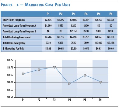
Marketing Cost Per Unit
Whatever your business, you sell "units" of something. It might be widgets or cases of widgets. It could be numbers of locomotive engines, or perhaps pounds of chemicals. Whatever your "units" are, you should be able to easily find out how many your company sells over a period of time. If you take the total marketing expense over that same period and divide by the number of units sold, you get a marketing cost per unit (MCPU). $1,000,000 in marketing expense divided by 250,000 units is $40 MCPU. Over time, you'd like to see the MCPU decline. You might also want to track your MCPU against your best estimates of your competitors.
Lag time is an important consideration if you're using MCPU. A dollar spent today on marketing may not influence a unit sale for several weeks or months. There is a strong argument that some of the money you're spending in marketing today is intended to create a long-term effect on unit sales that might not even show up in the current year. Regardless, you can likely discuss the lag time factors as a group (including finance) and arrive at an agreement on the expected timeframe of impact of the components of your marketing plan. When those expenses with long lag times are laid out on a calendar like the one in figure 1, they begin to overlap with short-term program expenses to create a total marketing cost in the current period. This provides the numerator for the calculation against the denominator of current period unit sales.
Over time, your accuracy at spreading marketing costs out over the proper period will increase, and hopefully your MCPU will improve as a reflection of increased efficiency.
Marketing-Mix Productivity
Marketing-mix models attempt to correlate investments in different communications media—broadcast, Internet, direct mail, print, outdoor—to actual sales volume. By using transactional data from all their points of sale, some companies can figure out the optimal mix for allocating marketing dollars. Unfortunately, most companies do their mix modeling on revenue, not profits. A dollar spent in one channel does not necessarily generate the same margin on a dollar in sales—so when discounting is done, sales may jump, but at the expense of profitability.
The scope of this article prohibits an in-depth discussion of mix models, but if you do have a mix model, consider reporting on the dashboard your overall contribution on total mix. If your modeling suggests you are getting $1.63 of contribution margin on each dollar of investment covered by the model, then your efficiency is 63%, before cost of capital. Showing how that efficiency improves over time will demonstrate good stewardship of company resources. Just be sure to keep the measurements consistent as market conditions (media rates, competitive activities, etc.) change.
Return on Important Initiatives
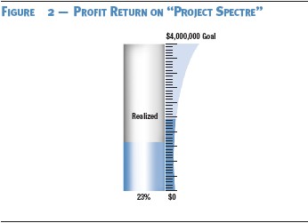
If there are big-spending initiatives in your marketing plan, such as a substantial overhaul of your Web site, a new packaging launch or just a big direct-marketing campaign, it may be appropriate to post the overall return for that project separately on your dashboard. If someone had to expend political capital to get the money to spend, you can underscore your commitment to getting the best return for the company's money by putting your progress right out where everyone can see it.
If the project has a target return that will take some time to achieve, consider reporting the work in progress, graphically comparing the present return to the goal in the form of a "thermometer" chart like the one in figure 2.
Program/Non-Program Ratio
This metric gives you the opportunity to look at the allocation of marketing resources to value-creating activities vs. overhead. Think about how charities are evaluated on the percentage of total funds raised that are distributed to the targeted recipients as opposed to salaries and overhead.
The higher the ratio, the more efficient the operation. The best charities are consistently in the 90%-plus range. What's your ratio? If the total marketing budget is $5 million, of which $4 million is allocated to specific program or campaign costs and $1 million to non-program costs, then your program/non-program ratio is 80%. There's your benchmark. Moving forward, you might set goals to increase that to 90% within two years.
It can be difficult to determine the line between value-creating activities and overhead, particularly when it comes to things like agency fees, payroll, staff development, or other issues. If this metric seems relevant to your situation, have a team develop a proposed delineation between program and non-program expenses and then try to apply it consistently over time.
Consider breaking it into three categories instead of two:
- Direct program resources
- Indirect program resources
- Non-program resources
Where you start from is less important than how well you progress toward your goal, while keeping your definitions consistent.
Program/Payroll Ratio
This metric is a simpler form of the program/non-program ratio. Take the total marketing budget and isolate the non-payroll-related expenses from the payroll dollars (fully loaded, if applicable) to get a baseline of how the resources are allocated to customer-reaching activities vs. internal process management. Many marketing departments that do this for the first time are shocked at how high the percentage of total resources allocated to payroll is. It's not uncommon in some multidivisional B2B firms or others that don't do much advertising to find a 50/50 ratio.
Again, there's no particular benchmark for the right ratio beyond the target that you believe is reasonable given your marketing objectives. Importantly, everyone knows that this metric can be easily manipulated by spending more money on existing advertising campaigns or shifting personnel from marketing into sales or operations. But if the metric is relevant to you, you'll find a way to define it in a manner that you can consistently apply in search of improvement in payroll leverage.
There might be 50 more metrics on this list, depending on your company and industry. Understanding the purpose of marketing efficiency metrics is a good way to start the process of designing your own.
Customer Metrics
Here are a few thought starters for how the customer might appear on the marketing dashboard.
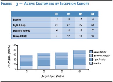
Active Customer Counts
How many of your customers are "active"—that is, consistently purchasing above some minimally acceptable level over time? This measure of customer-base vitality may tell you quite a bit about who is responding to your marketing activities and who is not.
Consider looking at cohort groups of active customers by longevity, if relevant. For example, what percentage of customers who first bought from you three years ago are still buying at least quarterly? What about those whose first purchase occurred only in the past 12 months? What is the difference between the two and why does it exist? How much are the groups purchasing and what is the product/service mix?
This metric might be even more telling when looked at from a profitability perspective than from a revenue view, but if vitality is really the question, revenue may suffice. If you don't have customer-specific transaction data but find this metric insightful, consider initiating either a panel study or tracking study of customers. Just keep the methodology consistent from period to period and the change over time will be more relevant than the absolute levels.
And remember to keep the orientation toward the predictive. For example, let's say we knew that there were 400 plastic-stamping companies that purchased a chemical compound from us to help keep the plastics malleable. At any point in time, we know how many of them our company is doing business with and we have an action plan to increase that number. If we structure this correctly on the marketing dashboard, we will be able to monitor our results against our plan and see whether we're projecting to close the gap on time and on budget.
Segment Mobility
You can do frequency distributions of customers by value—the percentage or actual number of customers contributing different levels of profit or gross margin. Even if you can only define groups of customers in terms of low, moderate and high profitability, these categories will give you more insight than top-line revenue breakouts.
You could also do frequency distribution of customers across product lines, meaning you'll begin to track customers that are only buying one product during a time period vs. others who are buying two or more. Customer longevity is another option that gives you a broader picture of how well you're keeping customers in the fold.
Some companies develop combinations of value metrics that place customers into multidimensional segments that describe current and potential future value. RFM (recency, frequency and monetary) analysis is the most common approach. Others use different combinations specific to their own circumstances. If you have a segmentation scheme that provides insights into future customer value (particularly in bottom-line terms), use it. Show how the customer base is migrating from one segment to another (hopefully more profitable) one. This is called segment mobility. See the example in figure 4.
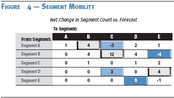
Some even prefer to focus on the velocity of segment mobility—the rate at which customers are migrating from one segment to another. All of these can become tremendously insightful, predictive metrics that forecast the health of the business.
The bottom line here is that frequency distributions are preferable to statements of average numbers because a simple frequency distribution graph implicitly tells you a lot more than an average ever can.
Share of Customer
Share of customer is your percentage of the total business that a customer does in your category. If the customer spends $3,600 a year on groceries and spends $1,200 a year in your grocery store, you have a 33% share of customer. This is another metric that works best in the form of a frequency distribution demonstrating mobility.
Share of customer is relatively easy to apply in categories in which the total annual purchase volume is more certain. For example, in retail gasoline, history has shown that the vast majority of consumers purchase between 1,000 and 1,200 gallons per year.
So it's not that difficult to estimate share of customer if you know how much they purchased from you. But if you don't have transactional data on your customer's purchases or don't know what the likely total consumption volume is, you'll need to explore panel studies or survey techniques to develop estimates and then measure improvements over time using a consistent methodology.
Customer Loyalty, Repurchase, or Referral
There are lots of ways you can define "loyalty." It can be defined transactionally, meaning a person purchased from your company a certain number of times in a given period—aka, the repurchase rate. Or loyalty can be defined emotionally, pointing to those customers who express a preference to do business with you in the future.
In the case of the former, you might choose to use dashboard metrics that portray the number or percentage of customers who purchased once, twice or three-plus times in the last quarter vs. forecast and the prediction for the next few quarters. Or, if you are limited to survey data on attitudes and intentions, you might choose to highlight the percentage of respondents indicating top- or top-two-box answers to purchase intentions and look at the following:
- How this most recent survey compares with prior surveys and the forecast response for this time period
- How the expectation for the future may change
Customer Experience Monitors
Here we get into the measurement of how consumers tell us they're happy or unhappy with what we're doing. They include the following:
- Satisfaction levels: Satisfaction measures are always great candidates for a dashboard because they demonstrate information everyone wants to know. The trick, though, is to express this information predictively. Some companies are finding that one simple question is accurately predicting customer repurchase rates: "How likely are you to refer a friend or family member to do business with us in the next few months?" If that simplicity works for you, the answer to that one survey question can be a very predictive dashboard metric, once calibrated.
- Quality perceptions: Perceptions of quality are a terrific way to measure part of the customer experience. Understanding where you are meeting, exceeding or falling short of expectations can help identify ways to improve the price/value relationship and decrease customer price elasticity.
- Order-cycle completion: This is the time it takes from the minute you receive an order from a customer to the time that order leaves your factory or reaches your customer's hands—depending on how you define the cycle. Across industries, order-cycle completion tends to be highly correlated with customer satisfaction. It's a common dashboard metric because faster-completed order times with accuracy can be easily calibrated over time as being predictive of reorders.
- Involvement/engagement levels: Beyond just transactional behavior, profitable customers might have a tendency to be more involved with you or engaged in the relationship. This engagement can take many forms, including responses to customer surveys, providing testimonials, completing customer comment cards or other alternatives. If you can establish that involvement among your customers and it's predictive of increasing customer profitability, reporting involvement and engagement levels on your dashboard is very appropriate.
- Repurchase intentions: Survey-driven findings indicate how likely customers are to repurchase and how much they'll spend when they do. It is important to know that these findings contain margins of error because there is a tendency for the consumer to either overstate or understate intentions. However, if you survey consistently with the right methodology over time and are able to track the stated intention to the subsequent actual behavior, you can develop a correction factor that you can apply to a stated intention. That will give you a fairly accurate, highly predictive view of how much you're likely to sell to that customer or segment of customers in the future.
- Compliments/complaints: This is a test for your inbound channels—call centers, Web sites, etc. The nature, frequency and magnitude of compliments or complaints are worth tracking on an ongoing basis as long as you can add some predictive value to the measurement.
- Resolution turnaround times: When you have a problem, how fast do you fix it? If your company is in a turnaround situation in which you know you have customer issues that need repair, this is a worthy subject to measure.
No company is going to find all of these measures appropriate. But depending on where you are in organizational sophistication and capability, some of these may be effective metrics for your dashboard. The whole area of customer experience monitors is often overlooked as dashboard metrics because of concerns that self-reported responses are methodologically suspect. But if you spend the time to develop a good methodology and you apply it consistently, the error factor normalizes over time. In other words, you see the same type and magnitude of error in each iteration of the survey, thereby eliminating the error and leaving only the real trend.
For example, if your Uncle Ernie consistently overestimates the number of loud teenage kids on his block by 5% to 10%, you can rely on his estimates in the future by subtracting 5% to 10% from whatever number he gives you. Likewise, if you find the error rate in self-reported purchase activity among customers is consistent over time, you can calibrate it to actual purchase activity with a high degree of confidence. You can use it to be very predictive with respect to future sales.
Return on Customer
Your customers are assets. Properly nurtured, they'll improve in profitability over time as they look to you to meet more of their needs. They'll hopefully purchase from you more efficiently and with less price elasticity.
You spend a certain amount of money to attract, retain, and nurture these customers. They in turn not only buy from you but also refer others to do the same. In some industries, the lifetime value of these customer relationships can be ascertained within reason.
When that lifetime value per customer is multiplied by the number of customers, you get a total value of the customer base. The investment you make in securing and defending those customers can then be compared against the change in the value of the base to get a "Return on Customer." For example, if you spent $25 million last year and achieved a net change in customer value of $50 million, your Return on Customer would be 100%.
This is an emerging thought process in gauging asset value. It has many potential challenges for most businesses. But if your company is oriented toward customer value creation, it might be a direction worthy of consideration for your dashboard, but with two caveats. First, as with most ROI metrics, be careful not to focus on the percentage return. It can be manipulated by reducing spend or claiming growth associated with marketing that would have occurred without the marketing stimulus. Second, believing that any single all-encompassing metric can consistently and accurately gauge marketing effectiveness is wishful thinking at best.
Conclusion
Marketing efficiency metrics are very common starting places for marketing dashboards. Likewise, most dashboards include some perspective on customer profitability evolution.
We've presented some examples of effective metrics in these categories as thought-starters to help you identify relevant metrics for your industry and company. We also underscored the importance of incorporating customer experience metrics as the voice of the customer on your dashboard.
Note: "Return on Customer" is a registered service mark of Peppers and Rogers Group, a division of Carlson Marketing Group, Inc. This article is excerpted from Dashboard Light: How to Get More Insight, Foresight, and Accountability from Your Marketing Investments.