Most marketers have learned the basics of pricing strategy in their business classes—cost-plus pricing, penetrative pricing, premium pricing, price skimming, and the like.
Each was a solid theory on how to manage the tricky question of pricing one's wares in varying market conditions. They worked well, too, at a time when prices were not compared with the click of a button or the swipe of a finger.
Pricing has moved with the times
Smartphones, tablets, even desktops have forced marketers to move on from age-old pricing models. They have had to dig deeper into buyers' thought process to understand what persuades buyers.
It's not enough to be the cheapest anymore. Your consumers need to think they're getting an awesome deal by buying your product. That "deal" might be in straight-out monetary terms, or based on prestige-of-ownership or the fear of missing out—or a variety of hidden persuaders.
Sometimes factors as innocuous as the font size of the price tag or the color in which the price is mentioned, or even the presence/absence of the dollar sign, can mean the difference between a sale and a missed opportunity.
Pricing tools (like Wiser) are now widely used to test the impact of minute price variations on consumer demand and conversions. Analyzing how users respond to various elements of a pricing strategy helps brands zero in on the best combination that works for the consumer and brand alike.
This article will explore some creative ways of pricing products for the digital age, backed by some sound research and practical applications.
1. Men see red when they shop
Most stores don't put too much effort into color-coding their price tags. But the ones that do have seen a distinct difference in how men and women respond to color.
Men responded positively to prices that were advertised in red, perceiving them to be lower than prices printed in black, according to a study conducted by Dr. Rajneesh Suri and his team from Drexel University's LeBow College of Business in 2013. The use of red made men feel positive and made them believe that they were being offered a good deal.
Interestingly, female shoppers seemed to not be affected by a change in the color of price tags. Women tended to process price data more deeply, recollect old prices, and compare them minutely, irrespective of the color they were printed in.
The findings were confirmed by another independent study published in the Journal of Retailing. That study consisted of three experiments in which respondents looked at price tags and ads in different colors and scored them with respect to how much they would save on each item. In all three experiments, male respondents thought they would save as much as 85% more with items that carried red price tags than those which had black tags.
The bottom line: if you're selling men's wear or gadgets aimed at a male target audience, use red for your price data!
2. Size does matter
Marketers have a tendency to go bigger, bolder, brighter with everything that they work on. However, the "bigger is better" philosophy does not apply in all cases.
Consumers are sensitive to the text size of discounted prices on price tags and product advertisements, according to researchers Keith Coulter and Robin Coulter from Clark University and the University of Connecticut, respectively. They found that consumers perceive price to be significantly lower when the reduced price is printed in a smaller font than that of the original price.
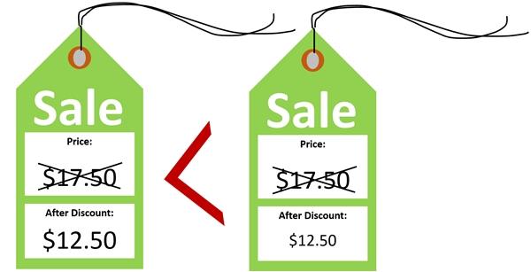
The logic is that the size of the text acts as a guideline to the users' brain: The smaller font for the discounted price tells them that the new price is reduced and much lower than the original price. It helps push the users into taking action, telling them that this is a great deal that must not be passed up.
So the next time you have a sale, keep the discounted price text size smaller than the text size of the original price of the item.
3. Drop those dollar signs
Almost all of us love to shop for new stuff, but nobody likes to part with money. The loathing of expense, even when we don't mind material consumption, makes us watch what we spend and ensures that we don't go overboard.
Researchers from Cornell University's School of Hotel Administration decided to trick users out of this mindset by having some fun with the way prices were displayed. They carried out an experiment at St. Andrew's Restaurant in Hyde Park, New York, where three menus were designed.
Menu No. 1 had prices preceded by a dollar sign, menu No. 2 had prices in plain numerals and no dollar signs, and menu No. 3 had prices spelled out in words. The researchers hypothesized that menu No. 3 would offer maximum sales because the prices were in words, not numerals, thus softening the blow of cost in the user's mind.
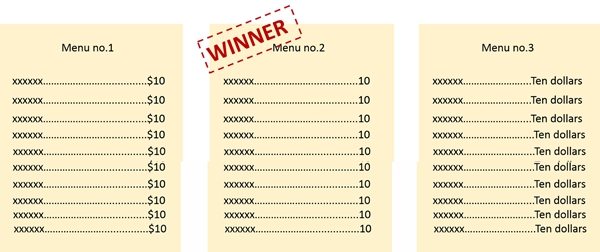
The results surprised the researchers. They found that menu No. 2—the one without dollar signs—turned out to be the most successful in sales. They found that the absence of dollar signs takes the pressure of spending off the users' minds, leading to them spend higher amounts.
The very mention of dollars, whether expressed in symbols or in words, reminds users of the expense they stand to incur and makes them hold back their spending.
In the context of dollar signs' putting people off spending higher amounts, an interesting experiment would be to accept payments in bitcoin. This new kid on the digital payments block has started going mainstream, with Amazon, Zappos, Expedia, CVS, and many others accepting payments in bitcoin. (If you sell products online, you can install a POS system that supports bitcoin payments to get started).
My hypothesis would veer toward consumers' spending higher amounts with bitcoin, thanks to the virtual nature of the currency and because they are not forking out dollars, of course.
Avoid using "$" on restaurant menus or other pricing situations where the user has to pick from a list of items, all with their prices mentioned alongside them.
4. FOMO
Like YOLO (you only live once), FOMO—fear of missing out—is one of the latest catchwords among young millennials and teens. It refers to impulsive decisions made out a fear of not being part of something fun, interesting, or valuable.
Though predominantly used by the young, "FOMO" is not just another teen slang. Research by Australia's Commonwealth Bank has found that 65% of buyers believe that property prices are driven by fear of missing out; moreover, 58% of Aussies actually go ahead and rush into property purchases driven by a FOMO mindset.
Apple builds up mass curiosity nearing hysteria around each new product launch and plays on users' fear of missing out to rack up unbelievable sales figures. Every fall, Apple releases its latest i-Can't-Afford-It-Phones, and long lines of people camp outside Apple stores to avoid the disappointment of not getting their hands on the latest new handsets.
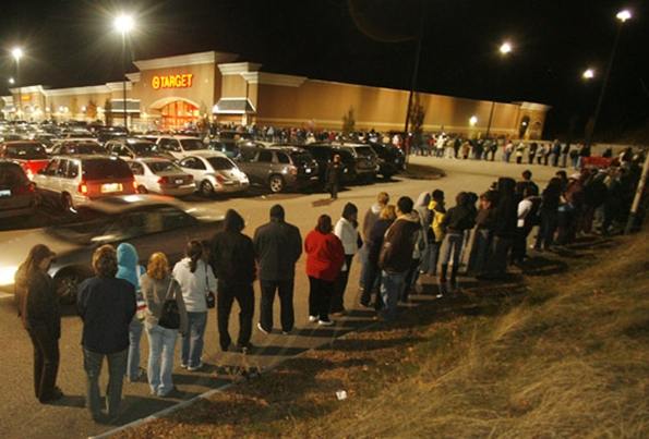
FOMO is what has played a big part in making Black Friday Sales sometimes dark and sinister: 7 deaths and 90 injuries are the price paid by eager shoppers queuing up overnight outside retailers like Wal-Mart, Target, and Best Buy to avoid missing out on killer shopping deals.
Use FOMO to your advantage by creating pricing signs that urge immediate action. Messaging such as "Last 10 items," "24 hours to go," and "Only for the first 50 customers" brings consumers' fear psychology into play, resulting in highly profitable impulse purchases.
* * *
Part 2 of this article will discuss three more approaches to pricing..