Your whitepapers should position you as an industry expert interested in helping your readers to make an informed decision.
But what if authoritative content isn't enough to keep them on the page? What if your design keeps them from finding the right messages—or makes them just give up and leave?
Readers won't waste their time on a whitepaper that creates visual barriers to legibility, readability, and comprehension. A badly designed whitepaper translates into unfulfilled stakeholder expectations, frustrated subject-matter experts, and wasted campaign budgets.
Marketers are actively involved in design, so here are five common whitepaper design mistakes that you need to look out for—and advice on how to avoid them.
Note: The screenshots in this article are from whitepapers that illustrate these mistakes; to protect the brands' identities, we've removed their logos.
Design Mistake No. 1: The Slick Sales Brochure
Readers expect whitepapers to be objective and educational. Nothing damages your credibility more than a design that swaps the traditional text-based format for something that resembles a sales brochure. It takes away your brand authority and undermines your argument.
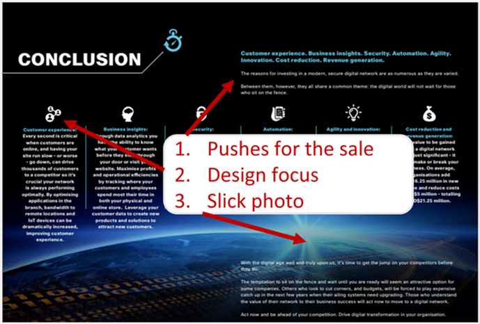
The Fix: Avoid design elements associated with a sales brochure.
Instead...
- Include the brand logo on the cover and the last page—not every page.
- Don't use photos as a background behind text.
- Ensure each page has more text than visuals.
- Don't overuse icons to replace bullets.
Readers expect whitepapers to be educational and text-focused, so images need to add meaningful content to your core messages. Your design should be related to your reader's primary motivation for clicking on your content rather than overtly promotional.
Design Mistake No. 2: The Massive Wall of Text
Pages cluttered with text hide everything—your core message, quotations, and statistics that back up your argument. Even worse, walls of text push your readers away from your whitepaper—toward content hosted by your competitors.
Design is about striking a balance between text and visual elements, and because whitepapers are traditionally text-focused documents, breaking that balance in either direction can cost you readers.
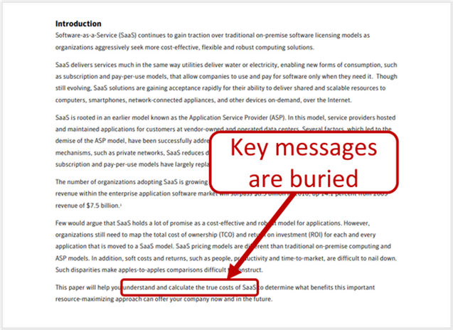
The Fix: Introduce text enhancements that highlight the most relevant information for readers so they can understand and remember your content easily.
Great text enhancements help your readers scan with purpose. Some examples:
- Bullets and lists help core elements stand out.
- Headings develop a clear narrative thread.
- Quotes pulled from the text highlight important data or key topics.
- Sidebars easily identify market drivers or challenges.
Text enhancements will help your readers develop a clear picture of your argument so they can find the value relevant to them.
Design Mistake No. 3: Long Lines
Even if you've written an awesome whitepaper, when lines of text are too long your readers can find them intimidating or overwhelming. And if you've used a small font or narrow margin, you're likely making the problem worse as readers get lost or lose track of your argument.
If your text is a strain on your readers' eyes and attention span, you're increasing the chances they will leave your content unread.

The Fix: Focus on readability.
The Baymard Institute published guidelines for text readability that will keep readers engaged with your whitepaper. They include...
- Optimal line length for body text (50-75 characters)
- Optimal line height (1.5x the font size)
- Optimal paragraph spacing (2x the font size)
- Optimal word spacing (0.16x the font size)
- Optimal letter spacing (0.12x the font size)
Fundamentally, powerful design means following basic rules to make sure that your readers find your whitepaper easy to read.
Even better, leave lots of white space. It makes your content visually appealing and maximizes engagement.
Design Mistake No. 4: Not Enough Graphics
An underuse of graphics can lead to disconnected information that isn't presented clearly or it's overshadowed by other visual elements; the reader is therefore left to struggle with individual ideas that don't seem to follow a clear priority or order.
The Fix: Think of graphical elements as a way to build your story with meaningful visual elements.
Use graphicsto...
- Compare and contrast data
- Illustrate trends and patterns
- Summarize research
- Visualize timelines or process steps
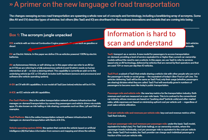
Design Mistake No. 5: Crowded Visuals
Do you want your readers to be put off by text and images that compete for attention? When there's too much data, along with too many font sizes and too many focal points, your readers will struggle to identify what's important.

The Fix: Avoid the temptation to add too many fonts, visuals, callouts, and data points.
To help your readers find what they need, be focused and targeted. You can do that by only sparingly using bold fonts, different typefaces, and color—drawing attention only to essential information.
* * *
The goal of whitepaper design is to enhance the message without affecting readability, legibility, or comprehension. When visuals are distracting or inappropriate for the format, they take away from the value your words have to offer, and you lose prospects.
It's important to take a step back from your design and identify what informational value your visual elements provide.
Your readers will judge your whitepaper based on visual cues that frame their opinion of your objectivity, expertise, and authority. If your design is well-considered, your audience will give you their time, attention, and loyalty.
More Resources on Whitepapers and Design
Struggling to Write Effective Whitepapers? Here Are Five Steps for Planning One
10 Shortcuts to Gathering High-Quality Whitepaper Content
Visual Design: Data-Driven Tactic or Qualitative Strategic Asset?