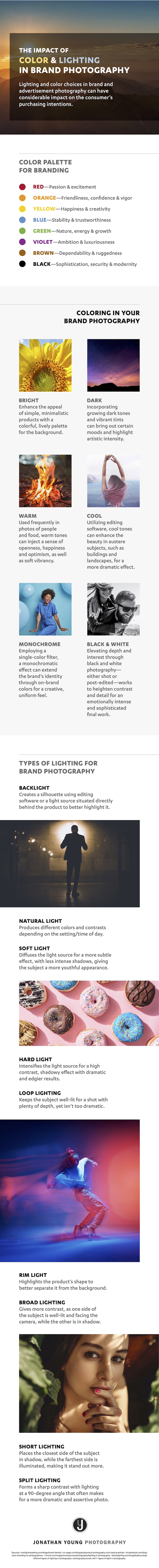
The color and lighting choices you make when producing marketing photography can deeply affect how your brand is viewed.

For example, relying heavily on red in images can spark excitement, whereas relying heavily on blue can broadcast trustworthiness.

An infographic (below) from Jonathan Young Photography examines how color and lighting in photography affect brand perception.

Specifically, it looks at what common palette, filter, and lighting choices tend to convey.

Check out the infographic:

Impact of color and lighting in brand photography 

Enter your email address to continue reading

How Color and Lighting in Images Affect Brand Perception [Infographic]

Don't worry...it's free!

Already a member? Sign in now.

Sign in with your preferred account, below.

Did you like this article?
Know someone who would enjoy it too? Share with your friends, free of charge, no sign up required! Simply share this link, and they will get instant access…
  • Copy Link

  • Email

  • Twitter

  • Facebook

  • Pinterest

  • Linkedin


ABOUT THE AUTHOR

image of Ayaz Nanji

Ayaz Nanji is a writer, editor, and a content strategist. He is a co-founder of ICW Media and a research writer for MarketingProfs. He has worked for Google/YouTube, the Travel Channel, and the New York Times.

LinkedIn: Ayaz Nanji

Twitter: @ayaznanji