I just finished a landing page optimization project for Alpha Software. The company relies heavily on a 30-day free trial of its Alpha Five database software, and then works to convert trial downloaders to purchasers via email marketing and inside-sales calling.
The results of the A/B split test on the company's landing page came back recently, and I am pleased to report that the optimized version is converting pay-per-click (PPC) clicks to free-trial downloaders at double the rate of the original landing page:
- Original landing page: 393 clicks at a cost of $670.53, converting to 20 downloads (5.1% conversion rate, $33.53 per converted lead)
- Optimized landing page: 386 clicks at a cost of $676.23, converting to 39 downloads (10.1% conversion rate, $17.34 per converted lead)
With almost the same media investment, Alpha is now driving nearly twice as many leads!
Here is a SlideShare presentation (watch it in full-screen mode) that documents what changes I made and why:
I applied the following six landing page optimization principles to this task.
1. Control the flow
You should design your landing page to function like a cattle chute, making your offer or call-to-action (CTA) the only possible path through the page. Sorry, I know that is a crude analogy for your prospects and customers! But your landing page will be much more successful at converting clicks to leads if you eliminate links that allow visitors to navigate away from the page:
- Eliminate top and side navigation. Even the top and side navigation bars that are parts of your website's template should be eliminated from your landing page. That approach is a really hard thing for Web designers and bloggers to wrap their heads around because their main mission is to encourage free flow of traffic across the site. But giving prospects an easy way to navigate to other content on your website is in conflict with your mission to get them to respond to your CTA.
- Eliminate extraneous navigation. Alpha's original landing page had a bunch of magazine review quotes at the bottom of the page that included hyperlinks to the actual articles. Including the quotes and logos was a good idea (see principle 3: "dispel anxiety"), but I eliminated the hyperlinks.
2. Sell your CTA
Use powerful language on you landing page to sell your CTA. Landing pages are often the forgotten variable in online lead-generation marketing campaigns. You spend so much time and money creating ads and offers and buying media... that you forget to continue to sell your CTA on the landing page, and so your prospects stall out and don't convert.
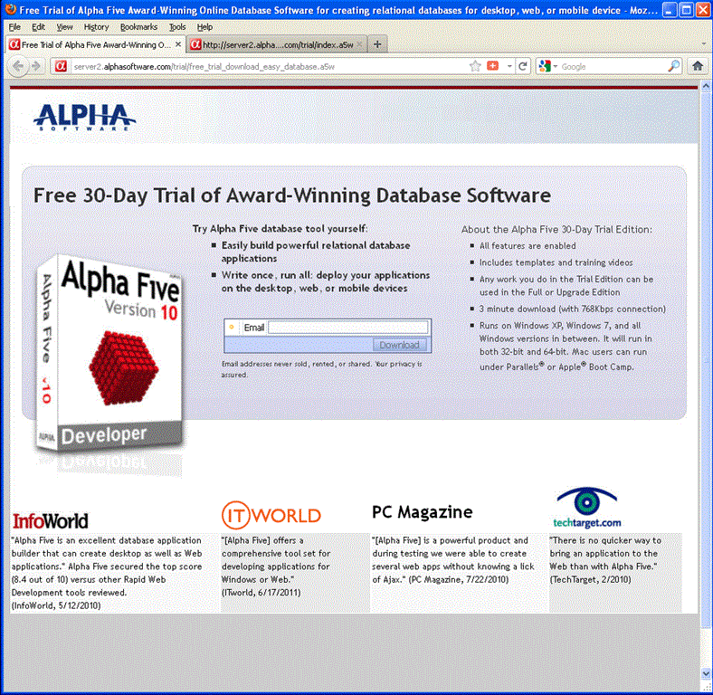
Alpha's original landing-page headline read "Free Trial - 3 Minute Download"—with no real explanation about what the product did or what its benefits were. It's no surprise the company had a low conversion rate. Why would visitors download a free trial of software if they don't even know what it is? So I rewrote the headline to read "Free 30-Day Trial of Award-Winning Database Software" and included two bullet points describing key benefits.
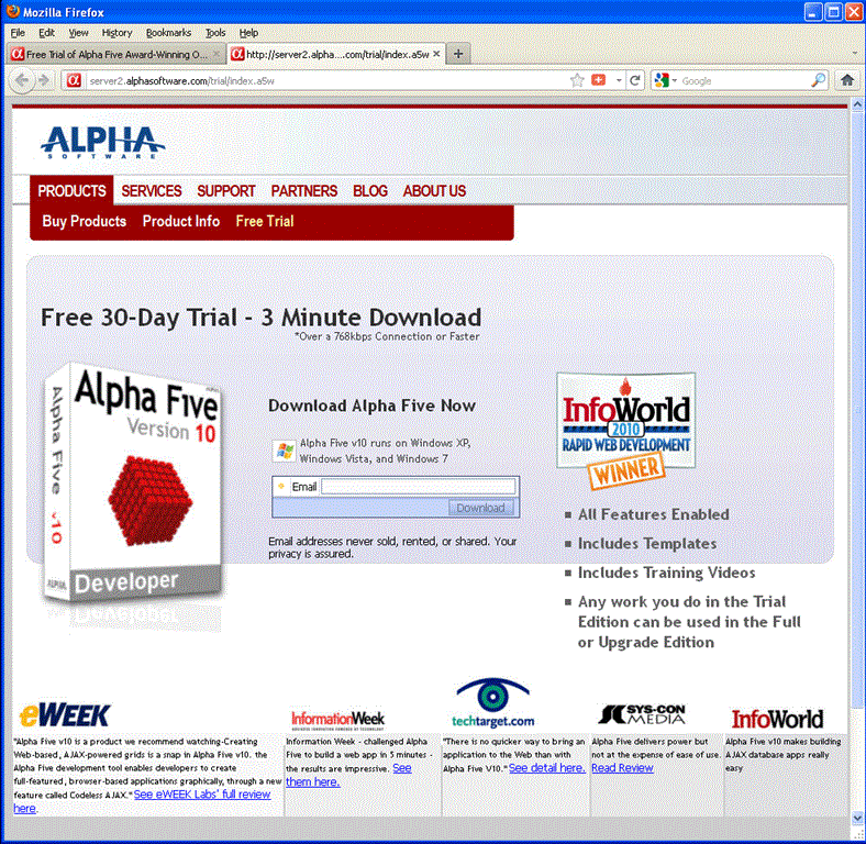
So I rewrote the headline to read "Free 30-Day Trial of Award-Winning Database Software" and included two bullet points describing key benefits.
3. Dispel anxiety
Today's prospects are cynical. If you want them to fill out your form and submit to inevitable marketing harassment, you'll need to dispel their anxiety and prove to them that you are worth the aggravation.
Here are three ways to gain your prospects' trust:
- Display your privacy policy. On Alpha's page, we noted the privacy policy right next to the "download" button.
- Include third-party validation. Third-party validation on your landing page will convince prospects that you are a reputable company. Alpha was fortunate to have a wealth of positive press reviews of its software, so we featured the logos and pull-quotes from those articles. You could also include award logos, professional certifications, logos of organizations with which you are affiliated, logos of well-known customers or business partners, etc.
- Shorten your forms. Asking for too much information may seem like an unfair transaction for anxious prospects and will cause massive form abandonment. Luckily, Alpha already recognized that risk, and the only piece of information it asks for on this landing page is the prospect's email address.
4. Tidy up the page
No prospect has a long enough attention span to plow through a poorly organized landing page. Here are some things I did to Alpha's page to tidy it up and make it easier for prospects to consume:
- Eliminate extraneous copy and graphics. For the optimized landing page, I reduced the number of magazine reviews displayed from six to four. One magazine wrote two articles about Alpha Five, so I kept the strongest one. I also pulled out three of the weaker reviews and replaced them with two stronger reviews that were not originally included. I also reduced the copy length for all the pull-quotes because they were too long and they forced Alpha to use type that was so small it was practically illegible. So the new page included fewer, pithier magazine reviews displayed in larger, easier-to-read type.
- Organize your copy. When I reviewed Alpha's original landing page, I noticed the messages were fragmented and scattered on the page. I categorized the content down into product description and benefits, trial download features, and press logos and quotes. I then created three content blocks on the optimized page for each category. The new page is organized and flows.
- Position the most important content above the scroll line. A fortunate byproduct of the tidying-up process is that we were able to move the most compelling stuff up higher on Alpha's landing page, enabling prospects to take in more of the content without scrolling. Overall, the page is tidier, easier to read, and shorter; as a result, it's less imposing to prospects who land on it.
5. Embrace good SEO principles
Did you know that Google AdWords gives priority to ads with landing pages that have higher relevancy scores for the keyword associated with the ad? So if you are bidding the exact same amount for a keyword as your competitor, but your landing page content is more relevant, Google will place your ad above your competitor's ad.
Here are a few SEO tips to keep in mind when designing your landing page:
- Use a descriptive HTML title tag. Alpha's original landing page had no title tag, so I added one that read "Free Trial of Alpha Five Award-Winning Online Database Software for creating relational databases for desktop, Web, or mobile devices."
- Use appropriate Meta information. I added Meta tags to the optimized landing page that included several of Alpha's most popular keyword phrases.
- Use popular keywords in your page copy. I added some of Alpha's most popular keyword phrases to the body and bullet copy of the page.
6. Keep testing
Results can always be improved. So, although we have taken a major step forward by doubling Alpha's conversion rate with this landing page optimization project, we can continue to test major and minor variations to further improve the conversion rate, testing elements such as...
- Headline
- Bullet copy
- Layout
- Button copy
- Button color
* * *
Related Reading About Landing Page Optimization
Though a lot of this stuff is just common sense, landing page optimization is actually a pretty well-documented science. The following are additional reading materials on landing page optimization:
MarketingProfs resources (free):
- [Article series] Clicking Me Softly: A Five-Day Crash Course in Conversion
- [Article] The Anatomy of a Novel-Sized Landing Page, Part 1
- [Article] The Anatomy of a Novel-Sized Landing Page, Part 2
- [Seminar] High-Performance Landing Pages That Boost Your Bottom Line
MarketingProfs resources (PRO):
- [Report] Landing Pages 101: Common Mistakes that Confuse and Confound—And How to Fix Them
- [Seminar] The 7 Deadly Sins of Landing Page Design
- [Tool] SmartTools: High-Performance Landing Pages
- [Case study] How a B2C's Website's Landing Page Tests Increased Conversions by 67%
- [Case study] How Siemens Medical Proved That a Landing Page With a Single, Compelling Offer Is More Effective
Other resources:
- GlobalSpec Marketing Maven Blog: Winning Landing Pages: An Eight-Point Checklist
- MarketingSherpa: Custom Landing Pages for PPC: 4 Steps to 88% More Leads, Lower Costs
- ClickZ: How Obvious Is Your Call To Action
- MarketingExperiments blog: Landing Page Optimization: Addressing customer anxiety
- MarketingZone blog: Website Landing Pages
(Image courtesy of Bigstock, Beautiful Cyber Woman.)


