The font choices you make for your email campaigns can have a big impact on performance and brand identity.

Picking the right fonts can help your business better engage audiences and convey its personality. Picking the wrong ones can undermine readability and annoy recipients.

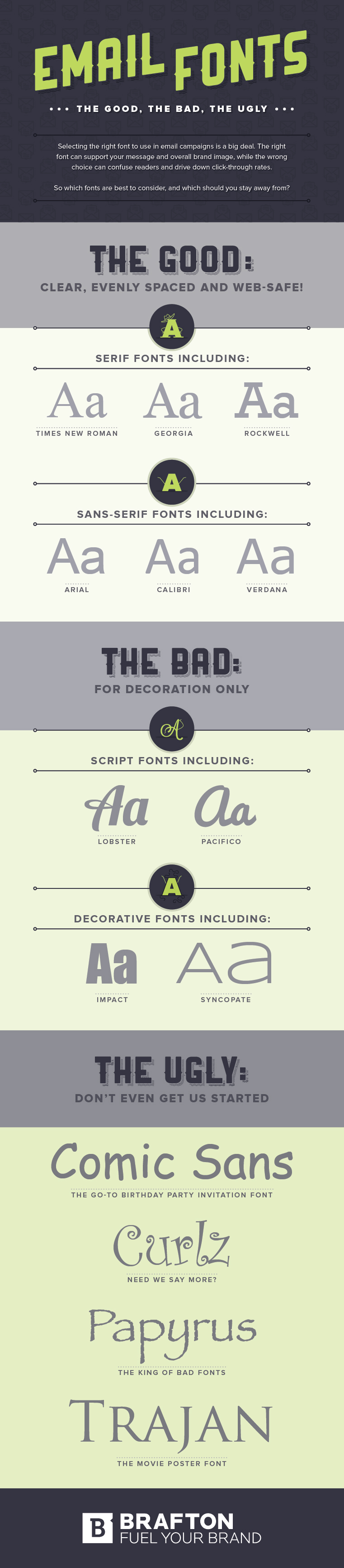
So, which fonts should you consider and which should you avoid?

An infographic (below) from Brafton provides an overview of email fonts for marketers.

It looks at good fonts (clear and Web-friendly), bad fonts (for decoration only), and ugly fonts (avoid at all cost).

Check out the infographic:


Enter your email address to continue reading

Email Fonts: The Good, Bad, and Ugly [Infographic]

Don't worry...it's free!

Already a member? Sign in now.

Sign in with your preferred account, below.

Did you like this article?
Know someone who would enjoy it too? Share with your friends, free of charge, no sign up required! Simply share this link, and they will get instant access…
  • Copy Link

  • Email

  • Twitter

  • Facebook

  • Pinterest

  • Linkedin


ABOUT THE AUTHOR

image of Ayaz Nanji

Ayaz Nanji is a writer, editor, and a content strategist. He is a co-founder of ICW Media and a research writer for MarketingProfs. He has worked for Google/YouTube, the Travel Channel, and the New York Times.

LinkedIn: Ayaz Nanji

Twitter: @ayaznanji