Conversion is the mechanism and process of pouring targeted consumers into, through, and out the other side of the marketing funnel. In day one of this five-part crash course, we explored the economics of conversion. In part two, you'll learn how to effectively use the ever-so-crucial call to action.
Day 2: The Call to Action
How do people convert?
In simple terms, they interact at a designated conversion point. They do this—and are triggered to do this—by a call to action.
What is a call to action?
A call to action (CTA) is an interactive instructional device intended to solicit an action from your visitors. A CTA has four main components:
- The Call. This is the instructional language used to request that the user interact in your desired way.
- The Action. On the Web, the most common action one can take is to click a button.
- The Outcome. The outcome is what happens when the action is taken, and it should correlate strongly with the call. In other words, it's the delivery on your promise. (e.g., "Download free whitepaper" indicates that clicking the button will begin a file download without a request for payment).
- The Design. How your CTA is presented visually plays a big part in how people respond to it (e.g., size, color, shape, contrast to rest of page).
A CTA for Every Page
As Mick Jagger sang so eloquently: "You can't always get what you want." But if you don't ask for what you want, you won't get anything. Accordingly, any page you create is a wasted opportunity if it doesn't specifically make a request of your visitor.
Every page needs both a purpose and a call to action.
Consider the following scenario:
Employee 1: "Nobody is signing up for our newsletter!"
Employee 2: "What newsletter?"
Employee 1: "We have a Feedburner email update that gets sent out whenever we write a blog post."
Employee 2: "How do people sign up for that?"
Employee 1: "Ummm, they have to click on the RSS icon and then select email as the delivery mechanism and such."
Can you see what's wrong with that conversation? The goal is to have customers read a blog post and then register to receive the blog newsletter. How it's configured is technically possible, but there is no instruction to persuade the visitor to take the desired action. Moreover, the working solution is neither obvious nor useful—conversion faux pas on both counts.
In this situation, it would be smart to place a CTA at the end of each blog post to engage the blog readers at their point of highest interest (assuming fairly that if they read to the end of the post, they most likely enjoyed it). For example:
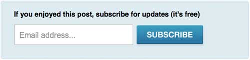
The headline encourages users to respond by leading with a hook into their emotional reaction ("if you enjoyed this post"), and makes a direct request for them to subscribe. Also, note how the call succinctly describes what will happen when you click.
Tip: The word "Submit" on a button tells you nothing about the outcome. Avoid it at all cost.
CTAs for Different Page Types
Here are some examples of calls to action that can be considered for other areas of your site:
- Blog posts: The email subscription example above is a classic use case. Others include recommending related posts and suggesting that people bookmark or share the post with their network.
- 404 pages: Your "page not found" page should help people recover from being lost. Make suggestions for what they should do. Include links to your most popular content, or start them down the sales process by linking to a product tour. Placing a large banner graphic on this page can also be a good way to solicit a positive action out of a negative situation (just make sure it's advertising your product, not someone else's).
- Confirmation pages: Engage your customers while they are in a positive, "buying mood" by adding a CTA to your transactional confirmation pages. You can extend your reach by asking people to follow you on a social network, or set a future date for re-engagement by inviting them to a webinar.
Day 2 Resources
A great showcase of CTA examples, along with design theory, is included in a classic post by Smashing Magazine on CTA best-practices.
Day 2 Task
A good test is to print out some of your pages (a product page, blog page, homepage, etc.), pin them to the wall, and give them "the six foot test." Standing six feet away, can you see a clear and identifiable action on each page? If it's not blindingly obvious what you want people to do on your page, you'll be losing conversions.
We'll also be exploring these CTA design concepts in depth later in this crash course.
MarketingProfs Resources
- Website Conversion Success Stories—11 case studies (publication)
- Take 10: Crank Up Conversions With Your Facebook Welcome Tab ( online seminar)
- Advanced SEO Strategies for Higher Rankings and Conversions (online seminar)
- The Seven Deadly Sins of Landing Page Design (online seminar)
- Sure-Fire Tips for Increasing Your Web Conversions (online seminar)
- Demolish the Roadblocks on Your Website: Clearing a Path for Customer Action, Sales and Loyalty (online seminar)
- High-Performance Landing Pages that Boost Your Bottom Line (FREE) (online seminar)


