Go PRO Now
Get unlimited access to all of our exclusive marketing resources
![35 Brands That Saw Web Traffic Jump After Logo Redesigns [Infographic]](https://i.marketingprofs.com/assets/images/articles/lg/260428-infographic-lg.jpg) Which major brands redesigned their logos and then saw significant increases in website traffic? To find out, researchers examined organic web traffic data from 2012 through 2026. more
Which major brands redesigned their logos and then saw significant increases in website traffic? To find out, researchers examined organic web traffic data from 2012 through 2026. more AI video tools are reshaping marketing by merging generative innovation with authentic storytelling. Discover how Sora, Vibes, and other tool are helping brands create faster, smarter, more human video. Read more. more
![The Most Lucrative Freelance Design and Short-Form Content Skills [Infographic]](https://i.marketingprofs.com/assets/images/articles/lg/250304-infographic-lg.jpg) Web design is the freelance design skill with the highest average hourly rate, and social media creation is the short-form content skill with the highest average hourly rate, according to recent research. more
Web design is the freelance design skill with the highest average hourly rate, and social media creation is the short-form content skill with the highest average hourly rate, according to recent research. more![Old-School Cool: The Power of Retro Logo Design [Infographic]](https://i.marketingprofs.com/assets/images/articles/lg/250130-infographic-lg.jpg) This infographic looks at the appeal of retro logos, the key elements to consider when creating one, and examples from brands. more
This infographic looks at the appeal of retro logos, the key elements to consider when creating one, and examples from brands. more![Seven Key Creative Design Trends for 2025 [Infographic]](https://i.marketingprofs.com/assets/images/articles/lg/250114-infographic-lg.jpg) Which emerging design trends should creative teams be watching in 2025? This infographic covers key findings from a recent study. more
Which emerging design trends should creative teams be watching in 2025? This infographic covers key findings from a recent study. more![10 Basic Elements of Design [Infographic]](https://i.marketingprofs.com/assets/images/articles/lg/241015-infographic-lg.jpg) This infographic looks at 10 fundamentals of design: lines, color, shape, space, texture, typography, scale, emphasis, balance, and harmony. more
This infographic looks at 10 fundamentals of design: lines, color, shape, space, texture, typography, scale, emphasis, balance, and harmony. more![How Iconic Brand Logos Evolved Over 100 Years [Infographic]](https://i.marketingprofs.com/assets/images/articles/lg/240910-infographic-lg.jpg) This infographic examines how iconic brand logos have changed over the past 100 years, with some undergoing radical transformations and others merely getting tweaked a bit. more
This infographic examines how iconic brand logos have changed over the past 100 years, with some undergoing radical transformations and others merely getting tweaked a bit. more![Color Psychology and Symbolism in Logo Design [Infographic]](https://i.marketingprofs.com/assets/images/articles/lg/240530-infographic-lg.jpg) Which feelings and emotions do different colors in logos elicit? To find out, researchers surveyed 285 professional graphic designers. more
Which feelings and emotions do different colors in logos elicit? To find out, researchers surveyed 285 professional graphic designers. more Which background colors, fonts, and design features are being used most on small business websites this year? To find out, researchers analyzed the design of 930 small business websites. more
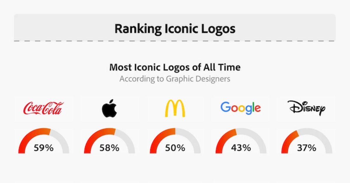 Which brand logos do graphic designers think are the most iconic of all time? What are the most iconic logos by industry? What are the key logo trends of 2024? Adobe surveyed graphic designers to find out. more
 Discover the transformative power of design in marketing. From brand identity to user-centric designs, visual strategies drive success. Read more. more
![How Color and Lighting in Images Affect Brand Perception [Infographic]](https://i.marketingprofs.com/assets/images/articles/lg/231205-infographic-lg.jpg) This infographic looks at what common palette, filter, and lighting choices tend to convey in marketing photography. more
This infographic looks at what common palette, filter, and lighting choices tend to convey in marketing photography. more Taking the humble PDF as an example, this article suggests three ways B2B marketers can embrace greater personalization—and why that matters. more
![How to Make an Infographic in Five Steps [Infographic]](https://i.marketingprofs.com/assets/images/articles/lg/230406-infographic-lg.jpg) Infographics are a great way to convey information succinctly and capture the attention of your audiences. However, creating one can feel daunting. This infographic covers five steps you can take to quickly develop one that's compelling. more
Infographics are a great way to convey information succinctly and capture the attention of your audiences. However, creating one can feel daunting. This infographic covers five steps you can take to quickly develop one that's compelling. more![Seven Infographic Design Trends for 2023 [Infographic]](https://i.marketingprofs.com/assets/images/articles/lg/230307-infographic-lg.jpg) Marketers looking to be on trend with their infographics this year may want to experiment with bright colors, animation, vintage vibes, personalization, gradients, linework, and data visualization. more
Marketers looking to be on trend with their infographics this year may want to experiment with bright colors, animation, vintage vibes, personalization, gradients, linework, and data visualization. more There's not much value in a whitepaper if otherwise valuable information is hidden by bad design. Here are five things to avoid. more
![Eight Graphic Design Trends That Will Dominate 2023 [Infographic]](https://i.marketingprofs.com/assets/images/articles/lg/230103-infographic-lg.jpg) This infographic presents the graphic design trends Venngage believes will dominate in 2023, including motion graphics, 3D elements, and inclusive visuals. more
This infographic presents the graphic design trends Venngage believes will dominate in 2023, including motion graphics, 3D elements, and inclusive visuals. more![Six Steps for Branding Your Emails Like a Pro [Infographic]](https://i.marketingprofs.com/assets/images/articles/lg/221101-infographic-lg.jpg) Through strong branding, you can ensure your messages stand out in inboxes, spark recognition with current customers, and build familiarity with new audiences. So, how can you brand your emails like a pro? more
Through strong branding, you can ensure your messages stand out in inboxes, spark recognition with current customers, and build familiarity with new audiences. So, how can you brand your emails like a pro? more![What Six Popular Colors Convey in Marketing [Infographic]](https://i.marketingprofs.com/assets/images/articles/lg/220927-infographic-lg.jpg) This infographic from Giraffe Social Media explores the psychology of six colors commonly used by marketers: red, blue, yellow, orange, green, and purple. more
This infographic from Giraffe Social Media explores the psychology of six colors commonly used by marketers: red, blue, yellow, orange, green, and purple. more Data this, metrics that... it can be hard to harness basic creativity in the current marketing environment. This article argues for a return to design and a focus on interactive content to break up the monotony. more
 It's hard to remember a time you could open an email and not be assaulted by buttons and graphics and neon colors. Is there any place for boring typeface in the marketing world anymore? Perhaps. Here are some situations when plain text is effective. more
![Four Social Media Design Trends for 2022 [Infographic]](https://i.marketingprofs.com/assets/images/articles/lg/220329-infographic-lg.jpg) This piece looks at four graphic design and styling approaches that marketers can use to make their social content feel more timely and original this year. more
This piece looks at four graphic design and styling approaches that marketers can use to make their social content feel more timely and original this year. more Sick of staring at cheesy stock images all day to use in your marketing? Don't fall into the people-looking-at-a-whiteboard hole. Check out these other eight visual content ideas. more
 When you plan an event, your first thought may not be "Ooh, gotta get the graphic design right." But virtual events have changed that. To make the most impact with your online B2B event, follow these five design tips. more
![How to Pick the Right Website Color Scheme [Infographic]](https://i.marketingprofs.com/assets/images/articles/lg/220104-infographic-lg.jpg) This infographic from WebsiteBuilderExpert provides a four-step process for determining the perfect website color combination. more
This infographic from WebsiteBuilderExpert provides a four-step process for determining the perfect website color combination. more
Results for All Content » Marketing Articles » Graphic Design: 1 - 25 of 283
1 2 3 4 5 6 7 8 9 10 11 12 Next